How to handle a client who wants AI everywhere
The trick isn't winning the argument about AI. It's handing the decision to the people who'll actually use it.
The trick isn't winning the argument about AI. It's handing the decision to the people who'll actually use it.
This is a collection of short stories by one of Ireland’s best playwrights.
I think you can tell that these stories were written by someone who’s at home with the stage. The dialogue really shines. And some of the stories feel like scenes in a play.
But that’s no bad thing. If most short stories are like mini-novels, why not have short stories that are like mini-plays?
Some of the stories are very short indeed, just long enough to convey the mood of the piece. That mood is often wistful, melancholy, or nostalgiac.
This collection comes with an equally brief introduction by the brilliant Louise Kennedy.
This slim volume makes for a great travel read. Slip it into your pocket and you’ll have an instant portal to a bygone time and place in the west of Ireland.

When my brother Pete and I were kids, and our parents were out of town, we ditched school for a week and cut an “album” by recording backing tracks to my dad’s reel-to-reel, then live overdubbing on different instruments and capturing the whole mess on a cassette recorder. We didn’t know what we were doing, […]
The post Underdubbed appeared first on Jeffrey Zeldman Presents.
If you do code-heavy talks in Keynote and want to syntax highlight the code, this might be for you.
CSS Grid Lanes has started to ship in browsers. It’s in Safari and behind a flag in Chrome and Edge.
It enables masonry layouts, where items get packed together in the most efficient way possible.
Unsurprisingly, I’m a fan of a layout tool where the browser does all the hard work. It very much aligns with the idea of declarative design; you specify the boundary conditions, and then browser does the maths and heavy lifting.
There’s a handy website called The Field Guide to Grid Lanes where you can play around with possibilities.
At the most recent CSS Day, Patrick Brosset gave a great talk showing what you could do with Grid Lanes. I immediately started playing around with it, and I spotted what I think could be a useful pattern…
Over on The Session, I added a little enhancement to the events and sessions listings recently. I make a call to the Google Places API to see if I can find a match for the venue, and if I do, pull in some photos.
Sidenote: right now there’s a major issue with this. None of the photos come with text descriptions. This is something I need to fix, and I’ve got some ideas on how to do that.
Anyway, these photos are just nice-to-haves so I’ve tucked them away into a details element with a simple summary like “Ten photos” or “Twenty photos”. If you open up that details element you get the photos in a horizontal swipable row. A carousel, if you will.
This works fine, but on larger screens I think it would be okay to show all the photos at once. That’s where Grid Lanes comes in.
Take a look at an event or a session in Safari to see what I mean.
Here’s the CSS that creates a carousel:
.gallery {
    display: flex;
    align-items: center;
    inline-size: fit-content;
    max-inline-size: 100%;
    overflow-inline: auto;
    scroll-snap-type: inline mandatory;
    overscroll-behavior-inline: contain;
    scroll-behavior: smooth;
    scrollbar-gutter: stable;
}
.gallery > * {
    flex-shrink: 0;
    scroll-snap-align: center;
}
And here’s the media query that turns it into a masonry layout:
@supports (display: grid-lanes) {
    @media all and (min-width: 56em) {
        .gallery {
            all: initial;
            display: grid-lanes;
            grid-template-columns: repeat(auto-fill, minmax(280px, 1fr));
            gap: 0.5em;
        }
        .gallery > * {
            inline-size: 100%;
        }
    }
}
I’m using all: initial to unset the previous styles, which is a bit of a sledgehammer but it works.
I think this could be a useful responsive design pattern. Masonry layouts are great for large screens but kind of rubbish for small screens where you end up with just a single column. Carousels aren’t much cop on large screens but maybe have their place on small screens where real estate is at a premium.
Oh, and needless to say, this is a progressive enhancement. If a browser doesn’t yet understand display: grid-lanes it continues to get the carousel layout.
I’m giving a talk this week.
Usually this wouldn’t be a big deal. I’ve been giving talks for over twenty years now. But this one is different.
I’m going to speaking at Na Píobairí Uilleann, the Society of Uilleann Pipers, in Dublin. They have a monthly series of lectures called Notes and Narratives all about Irish music, and they’ve asked me to deliver this month’s talk.
So this will not be my usual audience. I will be talking about a website, The Session, but I won’t be talking about the technology. There won’t be any mention of HTML, CSS, or JavaScript. Instead I’ll be talking about the origins of the site and how it—and its community—has evolved over time.
Oh, and at these Notes and Narratives talks, they also want some music interspersed to illustrate the points. So that’s something a bit different to my usual tech talks.
I’m not going to lie, I’m kind of nervous about this one. But I’m also excited. I’m genuinely honoured to be able to give a talk at such a fine institution.
I’m speaking on Thursday, June 18th at 8:30pm at the headquarters of Na Píobairí Uilleann, which is 15 Henrietta Street in Dublin. Doors open at 8pm. If you want to come along, tickets are €10/€5. The talk will also be streamed live online.
Wish me luck!
I give Apple a hard time. That’s mostly due to how they treat the web on their own mobile devices.
Though iOS ostensibly supports the ability for websites to be added to the homescreen, they make it so difficult for users to do, the functionality is practically worthless. It’s dispiriting to see the web so hamstrung by that decision.
The Webkit team has come in for other criticism too. For a while there, Safari was lagging so far behind in features that people were calling it the new Internet Explorer. Ouch!
But credit where credit is due. The upcoming version 27 of Safari is looking very good.
That’s not because it’s at the cutting edge of the latest web standards. Quite the opposite. Most of the changes listed for this release are bug fixes. That’s what I want to acknowledge and applaud.
Far too often a browser will rush out an implementation of an exciting new web standard that gets plenty of attention. But that initial implementation is rarely 100% correct. Then the next release rolls around and the focus has moved on to a different new web standard. The result is an ever-growing backlog of almost-but-not-quite-supported features.
Clearly the focus for Safari 27 was on that backlog. I bet that wasn’t an easy decision. Like I said, the kudos and recognition tends to go to the browser that ships new stuff, not the browser that goes back to fix long-standing issues.
Don’t get me wrong, there’s some exciting new stuff in Safari 27 too, like styleable select, but it’s great to see the focus on maintenance and repair:
If you look through the lists of features and fixes in Safari 27, you’ll notice that, although there are 58 brand-new features and 525 fixes — the largest pile of fixes in any Safari release in recent memory — most of what is released is not about new things.
Most of this work has been about existing features behaving more correctly, handling more edge cases, and fitting together with other features the way you’d expect.
This in sharp contrast to the most recent release of Chrome that shipped support for the prompt API despite opposition from other browsers and no positive signals from developers. I hope some Googler got a nice promotion for shoving a proprietary technology into a web browser, but they should be aware of the damage they’ve done.
At this year’s CSS Day, the represenatatives from Google Chrome were once again there to talk to developers and ask what we wanted them to prioritise. Those requests rang very hollow. Why should we waste our time and energy telling a browser team what we need if they’re just going to ship whatever crap they want?
The truth is that the folks from Google who were canvassing opinions from the attendees at CSS Day are not the same people who torpedoed the browser with unwanted proprietary tech. This team has spent years doing excellent outreach, documenting web standards, and meeting with developers. They built up an impressive amount of trust, respect, and goodwill.
That stock has now plummeted.
So well done to the Webkit team for Safari 27. And shame on the Chrome team for Chrome 148.
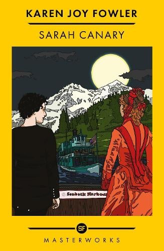
Sarah Canary is an odd book, in the best possible way.
On the one hand, it’s a relatively straightforward narrative. An adventure story set in the Pacific northwest in the late 19th century. The viewpoint shifts from character to character, with one exception. The inscrutable title character is a living macguffin that everyone and everything else revolves around.
That all seems straightforward enough, but if you squint at the story just right maybe it’s a story from a very different genre altogether.
So you can enjoy it on both levels; a well-told series of historical adventures, and a clever subversion of genre expectations. Whichever way you take it, there’s a running thread throughout the book exploring racism, sexism, and colonialism.
Quite the debut novel!
I’m heading to Amsterdam for CSS Day. It’s one of those events I try my best to get to every single year. I have no doubt that this year will be brilliant as usual.
There’s another event the day before CSS Day: The Web You Want:
What would the web be like if it was up to you?
There’ll be workshops and talks, all absolutely free.
I’ll be giving a talk. It’s supposed to be about the web I want, but I’m going to do my usual shtick of looking back at the history of the web to see what kind of things we wanted in the past. It’s called The Web You Wanted.
Register your attendance and I’ll see you there. Or maybe I’ll see you at CSS Day. Or at the session in Mulligan’s on Wednesday night.
The transition from phantom childhood to phantom adulthood feels like it could be a transition for us as well.
Look back in anchor tags: a partial review of my site’s 31-year visual history before diving into the new design.
The post Remembrance of zeldman.coms past appeared first on Jeffrey Zeldman Presents.
I've spent years selling quick wins to clients. But, I've started to wonder if I've been quietly part of the problem.
The Session existed in a very basic form since the late 1990s. It was just me posting a different tune every week.
But The Session as it is today—a community website where everyone can add tunes—first went online on June 3rd, 2001. That’s 25 years ago today.
Considering the typical lifespan of a web page, I’m proud of having a website still online and thriving a quarter of a century after launching it.
At this point it’s fair to say that thesession.org is my life’s work. Though, really, I’m just the curator; the site would literally be nothing without all the contributions that people have made to it.
It’s been a great 25 years so far, and I’m looking forward to the next 25.
She is not here to eat. She is here to ensure my compliance.
The post She’s the Boss. appeared first on Jeffrey Zeldman Presents.
I few weeks back, I got an email with the subject line, Screenshot in an Exhibition:
I am currently developing an exhibition celebrating the thriving folk musics of these islands for the Royal College of Music Museum and one of the showcases looks at the Sharing of folk music and collections. As an incredible and heavily used repository of tune collections, I would like to print a graphic screenshot of a page from The Session to demonstrate digital dissemination, sharing and preservation of tune collections. Are you happy for me to do so?
I replied that I’d be honoured!
The exhibition opened on May 19th. I just happened to be in London a few days after that for the Gaeltacht cois Tamaise. So I arranged to have a little tour of the exhibition from its curator, Jennifer Brian.
It’s a really nice collection, and it was kind of surreal to see my website in amongst esteemed artifacts of folk music history.

I’m not used to The Session getting recognition from a museum, but I am used to getting kudos when I tell fellow trad musicians that I made the website. I joke that it’s my passport to free pints anywhere there’s a session happening, but it’s true.
The next night when I was playing in the session in the pub, Brendan The Navigator, I outed myself about halfway through the evening when I handed out some stickers for the website. Sure enough, someone immediately asked if they could buy me a pint.
I must admit it’s very gratifying when people appreciate the work that’s gone into building and maintaining The Session.
The exhibition at The Royal College of Music Museum is free and runs until October. If you’re in the neighbourhood, you should drop in and check it out.
A way to create a diagonally split header cell without mangling accessibility, I hope.
Bhí me i Londain an deireadh seachtaine seo caite mar gheall ar an Gaeltacht cois Tamaise. Cúpla lá iontach ba ea iad!
Bhí na ranganna ar siúl Dé Sathairn agus Dé Domhnaigh, ceithre huaire an chloig gach lá, i gColáiste na Rí. Bhí ceithre leibhéal ann—tosathóiri, meanleibhéal-iseal, meanleibhéal-ard, agus an ardleibhéal. Bhí gach rang lán le foghlaimeoirí.
Roghnaigh mé an rang meanleibhéal-ard agus bhí an leibhéal foirfe. D’fhreastail Jessica ar an rang tosathóirí agus dúirt sí go raibh a mhúinteor iontach deas freisin.
Bhraith sé aisteach a bheith ag labhairt Gaeilge i lár na phriomhcathair Shasana, ach bhain mé go leor sult as!
Roimh na ranganna, bhí imeachta ar siúl ar an Embasáid na hÉireann ar an tráthnóna Dé hAoine; taifeadadh beo ar an bpodchraoladh How To Gael le Louis Cantillon agus Doireann ní Ghlacáin. Éistim leis an podchraoladh, mar sin thapaigh mé an deis iad a fheiceáll beo. Mná cliste agus greanmhar is ea iad!
Bhí imeachta eile ar siúl ar an tráthnóna De Sathairn ach ní raibh mé ann. Chuaigh mé go dtí an teach tabhairne Brendan The Navigator i Highgate—i bhfad ó croílár na caithreach!—mar gheall go raibh seisiún ceoil ann. Seisiún iontach iontach deas a bhí ann le daoine fáiltiúil agus go leor poirt áille.
Beidh mé ar ais!
Cameron Cummins-Smith’s grand unifying theory connects the far right’s seemingly disparate obsessions—from trans panic and great replacement theory to anti-feminism and white birth-rate anxiety—into a single ideological system fueled by pornographic narratives: In physics there is this idea of a theory of everything: a single, unified model that can describe all physical phenomena in the […]
The post Required reading: “The Interracial Cuck Porn Theory of Everything” appeared first on Jeffrey Zeldman Presents.
“GIs in Paris” by Floyd Davis. Davis served as a Life Magazine artist during WWII, where he was stationed in Paris, France.
The post Lest we forget appeared first on Jeffrey Zeldman Presents.
I enjoyed Kim Curran’s debut novel, The Morrigan, so when I saw a copy of her brand new book in the local library, I snapped it up.
Like The Morrigan, Brigid is modern retelling of Irish mythology, but in a very different time period. Whereas The Morrigan was set in a mythical time of the Fomorians and the Tuatha Dé Danann, Brigid is set in the relatively recent past of early Christian Ireland.
I was curious to see which Brigid this book would be about: the pagan goddess or the Christian saint?
Both, it turns out. The protagonist is the saint, but the narrator is the goddess. And they interact. It’s a clever framing device and for the most part, it works.
There are cameos a-plenty from the Christian pantheon like Patrick and Brendan the navigator but this is not the hagiography we learned in school. All the usual miracles are present and accounted for, but any supernatural powers aren’t ascribed to a Christian deity.
The world of Brigid isn’t so far removed from the world of The Morrigan after all.
Brigid isn’t a ground-breaking book, and it didn’t grab me as much as The Morrigan but it’s an enjoyable read nonetheless.

Acquiring a new customer costs about five times more than keeping an existing one. So why do organizations still obsess over the top of the funnel?
AI is doing more than making us faster. It's changing the fundamental nature of what our work is, and the sooner we adapt, the better.
A practical use case for rendering HTML+CSS to a canvas, an emerging API being previewed in Chrome.
UX is under pressure. A proactive maturity audit gives you a voice before leadership makes decisions about your team without you.
Maybe I’m special. Or unlucky. But things that supposedly work intuitively for most users tend to fail spectacularly for me. After stints in academia, journalism, advertising, and music, I poured myself into web design in early 1995. I understood it in a way most designers didn’t, and rose faster than I probably deserved—until the summer […]
The post My UX Superpower: Nothing Works! appeared first on Jeffrey Zeldman Presents.
It was a spring that felt more like winter last week in New York; suddenly it feels like summer. After my air-conditioned bedroom, the living room and kitchen was like a walk-in oven. A weirdly yellow bulb lit the kitchen. The kids must have left it on when they went to bed. I made an […]
The post Pete’s Presence appeared first on Jeffrey Zeldman Presents.
Brevity was always a discipline. Now it’s a statement.
The post The Courage to Stop appeared first on Jeffrey Zeldman Presents.
What Carter did in his speech was something rare in the annals of democratic government: he confronted the people with the truth—about his own failings, about the reality of the world around them, and most importantly about themselves. Even as Americans grow, for the second time, disillusioned with a Trump presidency, we have put drapes […]
The post Jimmy Carter was right appeared first on Jeffrey Zeldman Presents.
Most UX teams are too small to shape the whole experience. An organizational AI skills library might be the answer.
The best project management tool is still a pen, plus the discipline to notice what the machine cannot. Wisdom from Lucas Radke.
The post Handwritten notes in the time of AI note takers appeared first on Jeffrey Zeldman Presents.
If you’ve followed my work for any length of time, you’ll know I have strong feelings about one-size-fits-all processes. What we bring to the table as UX professionals isn’t a fixed methodology. It’s a toolkit of approaches (top task analysis, persona creation, customer journey mapping, diary studies, surveys) and, more importantly, years of experience knowing […]
A web developer
