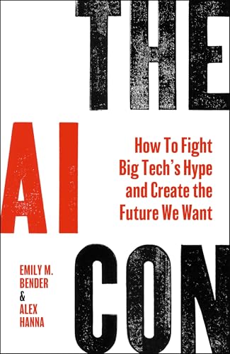
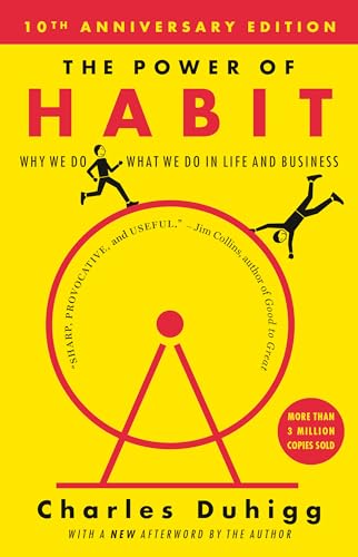
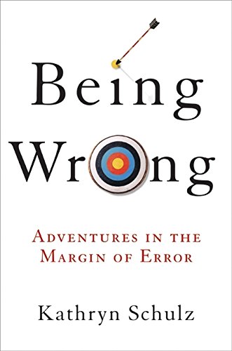
The Blogroll

From: Chris Coyier

Media Diet

đŸŽ” Florence + The Machine, Everybody Scream — I have no prior Florence experience but really like this album. The whole “start slow and build a song to a wild ass peak” thing works for me. “You Can Have It All” is a favorite. A little called out by “It must be nice to be a […]

From: Zeldman

Accessibility is a human right, cruelty a human wrong.

Once more for the folks in the back. Calibri is easier than Times New Roman for folks with certain visual disabilities to read. That’s why the Biden Administration chose Calibri for their digital communications: to include more people and make life just a wee bit easier for the disabled. And who in their right mind could […]

The post Accessibility is a human right, cruelty a human wrong. appeared first on Jeffrey Zeldman Presents.

From: Stuff & Nonsense

I made a tool to generate Toon Text

Partway through writing an upcoming article for Smashing Magazine, I decided it would be helpful to have a tool to generate text styled like that in my beloved cartoon titles. So I made one.

My Toon Text tool enables you to add colours, strokes, and multiple text shadows. You can change the paint order, apply letter-spacing, and preview your text using a few sample fonts. Then, you can copy the CSS to your clipboard to use in a project.

I’ll no doubt refine it over time, but for now, here’s my Toon Text generator. You might also like my growing collection of Toon Text examples, inspired by classic Hanna-Barbera title cards.

From: Stuff & Nonsense

Unfinished Business #138: Would you like a glass of champagne?

In this episode of Unfinished Business, Andy and Rich talk about retainers and maintenance contracts, and Andy asks Richard’s advice on how to sell them to new clients. As he’s prone to do, Andy also talks about Wrexham football club.


Sponsored by Contract Killer

Most web design contract templates are stuffed with boilerplate content your clients will never read. Contract Killer covers everything—payments, revisions, scope, and timelines—in plain, human language. Trusted by designers for over a decade. Peer-reviewed, fully customisable, and built to keep projects on track, and your invoices paid.

Buy Contract Killer


Also available on YouTube

For anyone who can’t get enough Unfinished Business, we publish the show in video format on YouTube.

Watch “Unfinished Business” on YouTube

Sponsor Unfinished Business

The best way to promote your product or service to the Unfinished Business audience of creative professionals, designers, and developers. Sponsors get one exclusive two-minute ad per episode, live read by me or Rich, which feels personal and relatable. We can use your script or ad-lib, and you’ll also receive a link on each episode’s post, as well as a thank-you on our Bluesky and Mastodon accounts. Interested? We’d love to hear from you.

Support Unfinished Business on Patreon

We also have three monthly membership plans so you can support Unfinished Business on Patreon. $5, $10, and $20 if you’re feeling especially generous. All money goes towards podcast editing and hosting. Support Unfinished Business on Patreon.

From: Chris Coyier

Ol’ Bob

My friend Jason came over as he’d just got a new MacBook and a new Black Lion audio interface he wanted to try out. We plugged my Ear Trumped Mabel into it and did a few songs. I dragged my web cam setup downstairs to do the video haha. The song is Ol’ Bob from […]

From: Adactio

Skip intro

There’s the old adage “nobody gets fired for buying IBM”. Or to put it more broadly, “everyone else is doing it.”

It’s dispiriting how often this explanation is given as justification for a dubious design decision, from home-page carousels to cookie banners.

Nic Chan has written a great post about designing a contact form and how the process was derailed by the client pointing to other people’s contact forms 
even when they’ve got very, very different user needs.

It’s especially depressing when “everyone else is doing it” is used a substitute for any kind of accountability.

Building an email service that’s going to track when people click on links in an email? That sounds dodgy. On the other hand, everyone else is doing it.

Building a straightforward website, but making it a single-page app with client-side React that will be barely work on some devices and networks? That seems over-engineered. On the other hand, everyone else is doing it.

Sometimes the “everyone else is doing it” phenomenon leads to a chain reaction where nobody even knows why anyone ever did it in the first place.

Remember Flash? Remember when almost every website had a Flash intro? Everyone knew they were annoying and uneccessary, but everyone else was doing it.

Instead of getting rid of the intros, we got “skip intro” links instead. This link was guaranteed to have a 100% clickthrough rate.

I’ve noticed something similar with conference talks. So many of them begin with a little spiel about the speaker, their background, and their work experience.

This might be interesting information, but this isn’t the right time or place for it. It’s already on the conference website, in the conference programme, and has probably just been reiterated by the conference host who just introduced the speaker.

When I’ve asked why people do this, the responses generally come down to “everyone else is doing it.” It’s become an expected part of the conference talk, just like a Flash intro used to be an expected part of a website.

When I’m curating a conference, I like to send speakers some information to help them prepare their talk. Some of this is practical stuff, like the tech set-up. Some of it is guidance for the slides, like ensuring sufficient colour contrast. And then there’s this:

Please don’t begin your talk with an introduction about yourself and your work history. You’ll be introduced on stage so it would be a shame to just repeat all that again. Also, it just gets in the way of the actual content of your talk. No need to provide your bona-fides.

Personally, I just find it super cringe. That’s why I don’t do it if I’m giving a talk myself.

As a host however, it’s a big part of my job. It’s way less cringe to have someone else big you up before the talk then doing it yourself.

From: Boagworld

Your Christmas Shakedown!

I'm disappearing until January. But first, a festive shakedown.

From: Boagworld

How UX Professionals Can Lead AI Strategy

Lead your organization’s AI strategy before someone else defines it for you. A practical framework for UX professionals to shape AI implementation.

From: Stuff & Nonsense

A new workshop space for my side projects

You know what it’s like. You decide to make a fun little side project. No need to integrate it into your main codebase. It doesn’t have to have compatible CSS or HTML, so no worries. Then you make another one. Same deal. Then another. Oh. All of a sudden, you have several projects, and there are annoying differences between them.

That was me. I made my collection of classic cartoon toon titles cards. Then I added my new toon text collection and created a tool for making cartoon-style text. I also had the hosted examples from my magazine articles, and when I looked at them together, the differences were too much for me to ignore.

Space for creative code experiments and passion projects

So for the past few evenings, I’ve been bringing all these little projects together into what I’m calling my “workshop”. It’s essentially a landing page linking to the various projects.

I also created unified headers and footers, as well as a stripped-down stylesheet. The overall CSS architecture is a little more complicated than I’d like, but it works for now:

  1. Top level stylesheet for all workshop components (workshop.css)
  2. Second-level stylesheet for specific projects (styles.css)
  3. Embedded CSS on specific pages, for unique elements

Hopefully, this will make new projects and updates to existing ones easier. Plus, I feel happier that everything feels more integrated into my overall website design.


Go to my workshop.

From: Boagworld

AI for UI Designers: From Fear to Fluency

A realistic look at AI's impact on design careers, plus practical techniques for using AI in brand research, wireframing, and prototyping.

From: Chris Coyier

The Jeopardy Phenomenon

There’s the thing where if you’re reading an article in the newspaper, and it’s about stuff you don’t know a ton about, it all seems well and good. Then you read another article in the same paper and it’s about something you know intimately (your job, your neighborhood, your hobby, etc) there is a good […]

From: Stuff & Nonsense

Getting creative with the Measure

Yours truly over at CSS Tricks: “I spend an unhealthy amount of time on the typography in my designs, and if you’ve read any traditional typography books, you might remember “the measure.” If not, it’s simply the length of a line of text. But measure means more than that, and once you understand what it represents, it can change how you think about layout entirely.”

Read Getting creative with the Measure.

From: Boagworld

Wrapping Up: Your Path Forward as a UX Leader

Final thoughts and encouragement for UX leaders navigating organizational challenges. Keep going from failure to failure.

From: Stuff & Nonsense

IW329303 4 ME AT 60

I’m not entirely sure how it happened, but it was yours truly’s 60th last week. I spent it in Germany with Sue and Alex and one of the highlights of the trip was buying a watch to celebrate that big birthday.

For years I’d said, “When I grow up, I want to buy an IWC Big Pilot.” IWC (International Watch Company) is based in Schaffhausen in Switzerland and I have fond memories of the place as I once worked with Sinar—a large format camera company—who were based near there.

Original IWC pilots watch

IWC first made its B-Uhr pilot’s watch for the Luftwaffe and was one of five suppliers to the German air force. The design requirements included an oversized crown—usable while wearing gloves—and a highly legible dial. Even its strap was extra-long, designed to be worn over a pilot’s jacket. But this isn’t a history of the Big Pilot. For that, you should read this article on Monochrome Watches.

We’d stopped in Schaffhausen on our way back from France this summer and visited the IWC boutique and museum connected to their factory. This was my first opportunity in a long time to try on the Big Pilot I wanted when I grew up.

2002 IWC Big Pilot without 2, 3, and 4 numerals.

IWC introduced a modern version (IW5002) of the wartime Die Grosse Fliegeruhr in 2002, retaining the signature elements of the original design. It had a matte black dial and highly legible Arabic numerals. It also included an impressively long power reserve, so—along with a date window at the six o’clock position—IWC added a power reserve indicator at three o’clock. That meant there was no room for a 2, 3, or 4.

2025 IWC Big Pilot with cut-off 2 and 4 numerals.

A few years later, IWC redesigned the dial (IW500401), and it’s stayed the same ever since. So the model I tried on kept the power reserve indicator but brought back the 2 and 4 numerals, with the indicator cutting across them. That’s a detail I honestly hadn’t noticed until I tried the watch on in the boutique. And when I saw it, I knew it was a detail I couldn’t live with.

My IWC Big Pilot 43 with a blue dial.

Fortunately, my dream wasn’t entirely shattered: in 2021, IWC released a smaller, more wearable 43mm version. The 46mm Big Pilot is a big watch, but as someone with big wrists, I didn’t mind that. I was concerned the 43mm might look too small on my wrist. Luckily, it didn’t. But most importantly, its design removes the date window and the power reserve indicator, restoring the full 2, 3, and 4 numerals. As I already own a black U-Boat watch, I opted for a Big Pilot 43 with a blue dial and strap and bought an extra brown strap to turn my watch into a mini Petit Prince design.

Open case back on the IWC Big Pilot 43.

And unlike the closed case of the 46mm Big Pilot, the 43mm model has an open case back to show off the movement.

To say that I love my new watch is an understatement. Yes, it’s an expensive item, but I’ll enjoy wearing it every day. That, and I’m only going to turn 60 once. It’s funny because I don’t consider myself a “watch guy,” and I didn’t wear a watch at all for 30 years. My social media feeds are full of videos about Rolex and other luxury brands, but I’m not interested in owning one of them. I bought my IWC because I like the simplicity of its design and because I’m nostalgic for Schaffhausen. This isn’t going to be part of a collection, although (please don’t tell my wife) I’d also love to own this.

IW510504, a limited edition stainless steel watch released in 2018 to commemorate IWC’s 150th anniversary.

Mum’s the word.

From: Dave Rupert

One thing churches do well

Two friends of mine (brothers, actually) got laid off from their job at a megachurch here in Austin. We met through a mutual friend that started attending their church. Our kids hang out on Roblox, so we’re connected through dadship and games. They oversaw a lot of the music and arts work that went into the weekly service. I wasn’t involved in the church so their unceremonious departure doesn’t impact me as much as folks in their community, but friends losing work is not fun and I feel for their families.

[Smash cut: my son on stage playing in front of pretend groupies]

My son is learning to play the guitar at School of Rock. One cool aspect about the School of Rock program is that you go from knowing nothing to performing a rock show in ~4 months after signing up. Recitals are nothing new when learning an instrument or a performing art, but those in my experience tend to be on longer annual timescales. School of Rock throws you in the deep end and that rock show commitment adds a lot of positive pressure to learn your instrument.

[Smash cut: me journaling in a coffee shop in my twenties]

These coinciding events got me thinking about church, music, and the relationship there of improving your craft through regular opportunities to perform. I thought about my past, my friends’ pasts, and my son’s potential future and I realized something that one thing faith-based communities do well is that they offer an endless series of opportunities for people to improve and show-off their talents.

At the heart of that is a not-so-secret ladder system. Nearly every faith community I’ve been apart of has had a buffet of special interest groups to rope newcomers in and get them involved at a level that matches their skill. They ask you about your interests and then encourage you1 to use those in service of the community.

  • Play music? You can play for a small group. Prove yourself and move onto the Wednesday service. Ready for the big Sunday show? Start as the fifth guitar. Then the third. Then lead.
  • Artistic? You do art with kids in Sunday school. Move on to making artsy b-roll videos. Your art in front of everyone in the big church: a painting, a solo, a poem, an interpretive dance!
  • Make websites or graphics? You can manage the WordPress, make the PowerPoints legible, make the weekly pamphlets, improve the signage, and spruce up the walls.
  • Like to talk in front of people? Go to a small group. Lead a small group. Lead a mission trip. Get on stage during the Sunday service. Lead the Sunday service when the pastor is out.
  • Have a knack for organizing people? Join a special interest group and invite friends. Encourage people to volunteer for the local Habitat for Humanity outreach. Be the greeter who connects people to special interest groups.
  • A closeted queer kid that loves theater? There’s the big Christmas show –sometimes with live animals!– that happens every year. Churches and youth groups love skits (for some weird reason). And the technical queers can run the soundboard or manage the lights. You may even get a headset.
  • Know a lot about a particular topic (bible, finance, history)? Lead a Sunday school class about it. Host a weekend seminar. A whole week seminar.
  • Handy? Join the church cleanup. Volunteer to fix that leaking window. Fix the broken A/C. Organize a shed or barn raising. Run the Habitat for Humanity group. Be the knowledgeable one on the mission trip.

There’s no shortage of jobs in a thriving community. And while some jobs skew business (the treasurer), administrative (the secretary), or mechanical (the maintenance crew); the bulk of jobs fall under the umbrella of the performing and visual arts. I find this curious in a world where getting a degree in fine arts is often chided or joked about as being non-contributing.

I assume other religions across the world have different flavors of these ladders of opportunity. And I assume secular volunteer organizations might have these kinds of ladders, but I imagine they have way less acoustic guitars. The “speaker circuit” in tech sort of functions like this; local meetup, to regional conference, to national, to international, to keynote speaker, to giving a TED Talk ladder is familiar.

Why would a church provide this service? What is this platform for the performing and visual arts worth? Well I can tell you we pay ~$400/month for School of Rock, so it’s somewhere in that ballpark. It’s possible this social apparatus does return dividends in the offering plate, but I think the key benefit this provides is a place of belonging. A place to exercise talents publicly and regularly that might otherwise remain dormant. Creating that ladder of opportunity is effective at keeping “involvement” –a community’s most important metric by which it lives and dies– at an all time high and engagement keeps the machine turning.

[Smash cut: an announcement board with a hand-drawn thermometer that’s half-filled and renderings of a new building mounted with poster putty]

In most of my experiences at a certain point (when money exchanges hands) and at a certain scale (over ~150 people), the church ladder begins to posture itself towards being another capitalistic corporate ladder with patriarchal undertones. The eternal growth model and the innate desire to build ever larger buildings replace vision and connection. The work becomes about managing real estate and optimizing to keep the pews full. Efficiency rises, the arts and music morph into a Live, Laugh, Love poster with mass appeal.

Anyways, if you were trying to build a new community (or replace religion with something more compassionate)
 I would think about building these kinds of ladders. I have no doubt you’ve encountered someone who has developed their gifts or skills in an incubator like this. You may even be reading a person-like-that’s blog right now.

  1. “Encourage you”, or “extract from you”, depending on your perspective or experience ↩

From: Adactio

Installing web apps

Safari, Chrome, and Edge all allow you to install websites as though they’re apps.

On mobile Safari, this is done with the “Add to home screen” option that’s buried deep in the “share” menu, making it all but useless.

On the desktop, this is “Add to dock” in Safari, or “Install” in Chrome or Edge.

Firefox doesn’t offer this functionality, which as a shame. Firefox is my browser of choice but they decided a while back to completely abandon progressive web apps (though they might reverse that decision soon).

Anyway, being able to install websites as apps is fantastic! I’ve got a number of these “apps” in my dock: Mastodon, Bluesky, Instagram, The Session, Google Calendar, Google Meet. They all behave just like native apps. I can’t even tell which browser I used to initially install them.

If you’d like to prompt users to install your website as an app, there’s not much you can do other than show them how to do it. But that might be about to change


I’ve been eagerly watching the proposal for a Web Install API. This would allow authors to put a button on a page that, when clicked, would trigger the installation process (the user would still need to confirm this, of course).

Right now it’s a JavaScript API called navigator.install, but there’s talk of having a declarative version too. Personally, I think this would be an ideal job for an invoker command. Making a whole new install element seems ludicrously over-engineered to me when button invoketarget="share" is right there.

Microsoft recently announced that they’d be testing the JavaScript API in an origin trial. I immediately signed up The Session for the trial. Then I updated the site to output the appropriate HTTP header.

You still need to mess around in the browser configs to test this locally. Go to edge://flags or chrome://flags/ and search for ‘Web App Installation API’, enable it and restart.

I’m now using this API on the homepage of The Session. Unsurprisingly, I’ve wrapped up the functionality into an HTML web component that I call button-install.

Here’s the code. You use it like this:

<button-install>
  <button>Install the app</button>
</button-install>

Use whatever text you like inside the button.

I wasn’t sure whether to keep the button element in the regular DOM or generate it in the Shadow DOM of the custom element. Seeing as the button requires JavaScript to do anything, the Shadow DOM option would make sense. As Tess put it, Shadow DOM is for hiding your shame—the bits of your interface that depend on JavaScript.

In the end I decided to stick with a regular button element within the custom element, but I take steps to remove it when it’s not necessary.

There’s a potential issue in having an element that could self-destruct if the browser doesn’t cut the mustard. There might be a flash of seeing the button before it gets removed. That could even cause a nasty layout shift.

So far I haven’t seen this problem myself but I should probably use something like Scott’s CSS in reverse: fade in the button with a little delay (during which time the button might end up getting removed anyway).

My connectedCallback method starts by finding the button nested in the custom element:

class ButtonInstall extends HTMLElement {
  connectedCallback () {
    this.button = this.querySelector('button');
    

  }
customElements.define('button-install', ButtonInstall);

If the navigator.install method doesn’t exist, remove the button.

if (!navigator.install) {
  this.button.remove();
  return;
}

If the current display-mode is standalone, then the site has already been installed, so remove the button.

if (window.matchMedia('(display-mode: standalone)').matches) {
  this.button.remove();
  return;
}

As an extra measure, I could also use the display-mode media query in CSS to hide the button:

@media (display-mode: standalone) {
  button-install button {
    display: none;
  }
}

If the button has survived these tests, I can wire it up to the navigator.install method:

this.button.addEventListener('click', async (ev) => {
  await navigator.install();
});

That’s all I’m doing for now. I’m not doing any try/catch stuff to handle all the permutations of what might happen next. I just hand it over to the browser from there.

Feel free to use this code if you want. Adjust the code as needed. If your manifest file says display: fullscreen you’ll need to change the test in the JavaScript accordingly.

Oh, and make sure your site already has a manifest file that has an id field in it. That’s required for navigator.install to work.

From: Adactio

The schedule for Web Day Out

Here’s the schedule for Web Day Out—what a fantastic collection of talks!

Web Day Out
10:00 – 10:30 I can’t believe it’s not JavaScript Jemima Abu
10:30 – 11:00 A pragmatic guide to browser support Rachel Andrew
11:30 – 12:00 Progressive web apps from the trenches Aleth Gueguen
12:00 – 12:30 Build for the web, build on the web, build with the web Harry Roberts
14:00 – 14:30 Breaking with habits Manuel Matuzovič
14:30 – 15:00 What’s new in web typography? Richard Rutter
15:30 – 16:00 Customisable <select> and the friends we made along the way Jake Archibald
16:00 – 16:30 The browser is the playground Lola Odelola

Seeing all of those talk titles in a row is getting me very, very excited for this day!

I hope that you’re excited too, and I hope you’ve got your ticket already.

If you need to convince your boss to send you (and your team) to Web Day Out I’ve put together some reasons to attend along with an email template that you can use as a starting point.

Also, if your company is sending a group of people anyway, consider sponsoring Web Day Out. You get a bunch of conference tickets as part of the sponsorship deal.

Hope to see you in Brighton on Thursday, 12 March 2026!

From: Boagworld

Quantifying UX Success and Proving Value

Learn to measure and communicate UX value through quantitative data, qualitative stories, and financial impact calculations.

From: Adactio

Why use React?

This isn’t a rhetorical question. I genuinely want to know why developers choose to build websites using React.

There are many possible reasons. Alas, none of them relate directly to user experience, other than a trickle-down justification: happy productive developers will make better websites. Citation needed.

It’s also worth mentioning that some people don’t choose to use React, but its use is mandated by their workplace (like some other more recent technologies I could mention). By my definition, this makes React enterprise software in this situation. My definition of enterprise software is any software that you use but that you yourself didn’t choose.

Inertia

By far the most common reason for choosing React today is inertia. If it’s what you’re comfortable with, you’d need a really compelling reason not to use it. That’s generally the reason behind usage mandates too. If we “standardise” on React, then it’ll make hiring more straightforward (though the reality isn’t quite so simple, as the React ecosystem has mutated and bifurcated over time).

And you know what? Inertia is a perfectly valid reason to choose a technology. If time is of the essence, and you know it’s going to take you time to learn a new technology, it makes sense to stick with what you know, even if it’s out of date. This isn’t just true of React, it’s true of any tech stack.

This would all be absolutely fine if React weren’t a framework that gets executed in browsers. Any client-side framework is a tax on the end user. They have to download, parse, and execute the framework in order for you to benefit.

But maybe React doesn’t need to run in the browser at all. That’s the promise of server-side rendering.

The front end

There used to be a fairly clear distinction between front-end development and back-end development. The front end consisted of HTML, CSS, and client-side JavaScript. The back end was anything you wanted as long as it could spit out those bits of the front end: PHP, Ruby, Python, or even just a plain web server with static files.

Then it became possible to write JavaScript on the back end. Great! Now you didn’t need to context-switch when you were scripting for the client or the server. But this blessing also turned out to be a bit of a curse.
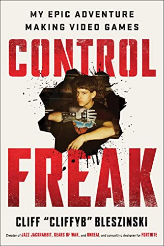
When you’re writing code for the back end, some things matter more than others. File size, for example, isn’t really a concern. Your code can get really long and it probably won’t slow down the execution. And if it does, you can always buy your way out of the problem by getting a more powerful server.

On the front end, your code should have different priorities. File size matters, especially with JavaScript. The code won’t be executed on your server. It’s executed on all sorts of devices on all sorts of networks running all sorts of browsers. If things get slow, you can’t buy your way out of the problem because you can’t buy every single one of your users a new device and a new network plan.

Now that JavaScript can run on the server as well as the client, it’s tempting to just treat the code the same. It’s the same language after all. But the context really matters. Some JavaScript that’s perfectly fine to run on the server can be a resource hog on the client.

And this is where it gets interesting with React. Because most of the things people like about React still apply on the back end.

React developers

When React first appeared, it was touted as front-end tool. State management and a near-magical virtual DOM were the main selling points.

Over time, that’s changed. The claimed speed benefits of the virtual DOM turned out to be just plain false. That just left state management.

But by that time, the selling points had changed. The component-based architecture turned out to be really popular. Developers liked JSX. A lot. Once you got used to it, it was a neat way to encapsulate little bits of functionality into building blocks that can be combined in all sorts of ways.

For the longest time, I didn’t realise this had happened. I was still thinking of React as being a framework like jQuery. But React is a framework like Rails or Django. As a developer, it’s where you do all your work. Heck, it’s pretty much your identity.

But whereas Rails or Django run on the back end, React runs on the front end 
except when it doesn’t.

JavaScript can run on the server, which means React can run on the server. It’s entirely possible to have your React cake and eat it. You can write all of your code in React without serving up a single line of React to your users.

That’s true in theory. The devil is in the tooling.

Priorities

Next.js allows you to write in React and do server-side rendering. But it really, really wants to output React to the client as well.

By default, you get the dreaded hydration pattern—do all the computing on the server in JavaScript (yay!), serve up HTML straight away (yay! yay!) 
and then serve up all the same JavaScript that’s on the server anyway (ya—wait, what?).

It’s possible to get Next.js to skip that last step, but it’s not easy. You’ll be battling it every step of the way.

Astro takes a very different approach. It will do everything it can to keep the client-side JavaScript to a minimum. Developers get to keep their beloved JSX authoring environment without penalising users.

Alas, the collective inertia of the “modern” development community is bound up in the React/Next/Vercel ecosystem. That’s a shame, because Astro shows us that it doesn’t have to be this way.

Switching away from using React on the front end doesn’t mean you have to switch away from using React on the back end.

Why use React?

The titular question I asked is too broad and naïve. There are plenty of reasons to use React, just as there are plenty of reasons to use Wordpress, Eleventy, or any other technology that works on the back end. If it’s what you like or what you’re comfortable with, that’s reason enough.

All I really care about is the front end. I’m not going to pass judgment on anyone’s choice of server-side framework, as long as it doesn’t impact what you can do in the client. Like Harry says:


if you’re going to use one, I shouldn’t be able to smell it.

Here’s the question I should be asking:

Why use React in the browser?

Because if the reason you’re using React is cultural—the whole team works in JSX, it makes hiring easier—then there’s probably no need to make your users download React.

If you’re making a single-page app, then 
well, the first thing you should do is ask yourself if it really needs to be a single-page app. They should be the exception, not the default. But if you’re determined to make a single-page app, then I can see why state management becomes very important.

In that situation, try shipping Preact instead of React. As a developer, you’ll almost certainly notice no difference, but your users will appreciate the refreshing lack of bloat.

Mostly though, I’d encourage you to investigate what you can do with vanilla JavaScript in the browser. I totally get why you’d want to hold on to React as an authoring environment, but don’t let your framework limit what you can do on the front end. If you use React on the client, you’re not doing your users any favours.

You can continue to write in React. You can continue to use JSX. You can continue to hire React developers. But keep it on your machine. For your users, make the most of what web browsers can do.

Once you keep React on the server, then a whole world of possibilities opens up on the client. Web browsers have become incredibly powerful in what they offer you. Don’t let React-on-the-client hold you back.

And if you want to know more about what web browsers are capable of today, come to Web Day Out in Brighton on Thursday, 12th March 2026.

From: Dave Rupert

Grid Paper

screenshot of my grid paper app with some configurable settings in a header and a grid covering the entire background

Try Grid Paper

I’ve been getting into drawing dungeons on isomorphic grids. It’s fun but I was a little frustrated with the process of sourcing and printing out graph paper with an isomorphic grid on it. You have two bad options, basically:

  1. Download a low-res JPG you found on Google Image search where the grid sizes are wonky and it has a giant URL on it. I needed something clean and simple.
  2. Buy grid paper on Amazon in bulk. Now I’m thinking about centimeters vs. inches, cost, color, paper size, style, and quantity before I draw a single dungeon. I needed something ad hoc and with less commitment.

After 15 minutes of getting frustrated I said “I can build this.” And so I did using HTML, CSS, and the tiniest bit of JavaScript. And because it’s a webpage
 why limit myself to one kind of grid? I’m able to support ~7 grids types using different kinds of background gradients:

  • Grids
  • Dot Grids
  • Isomorphic Grids
  • Isomorphic Dot Grids
  • Dual Hex Grids
  • Perspective Grids
  • Two-Point Perspective Grids

Feeling good about this little tool. The quality can be a bit blurry but background gradients and printers are weird. It’d be nice to make it crisper and I might put some effort at the task (use SVG patterns?)
 but at less than 5kb and a couple of nights worth of work, I’m happy with the result. It “made the rounds” as they say on the socials and seems to be a common issue other people experience, so I’ll call that a success.

From: Adactio

A child’s Halloween in Ireland

As part of their on-stage banter, The Dubliners used to quip that “All the books that are banned in Ireland should be published in Irish, to encourage more people to learn their native tongue.”

There was no shortage of banned books back in the day. I’m reading one of them now. The Country Girls by Edna O’Brien.

About halfway through the book, I read this passage:

The parcels for the Halloween party were coming every day. I couldn’t ask my father for one because a man is not able to do these things, so I wrote to him for money instead and a day girl brought me a barmbrack, apples, and monkey-nuts.

Emphasis mine, because that little list sounded so familiar to me.

Back in 2011, I wrote a candygram for Jason. It was called Monkey nuts, barmbrack and apples.

It’s not exactly Edna O’Brien, but looking back at it fifteen years on, I think it turned out okay.

From: Adactio

Manuel Matuzovič is speaking at Web Day Out

The line-up for Web Day Out is now complete! The final speaker to be added to the line-up is the one and only Manuel Matuzovič.

You may know Manuel from his superb Web Accessibility Cookbook (full disclosure: I had the honour of writing the foreword to that book). Or perhaps you’re familiar with the crimes against markup that he documents at HTMHell. But at Web Day Out, he’s going to be talking about CSS.

The past few years have seen a veritable explosion in CSS capabilities. It’s one thing to hear about all the new stuff in CSS, but how do you actually start using it?

You may need to unlearn what you have previously learned. That’s what Manuel’s talk will be covering:

Manuel built a new project from scratch with modern CSS and questioned every line of code he wrote.

In this talk, he presents what he has learned and encourages you to review your best practices.

You can see why I’m so excited about this—it’s perfect for the agenda of Web Day Out:

Do you feel like you’re missing out on some of the latest advances in HTML, CSS, and JavaScript APIs? Web Day Out is your chance to get up to speed on what matters.

There’ll be eight brilliant speakers for your entertainment:

  1. Jemima Abu
  2. Rachel Andrew
  3. Jake Archibald
  4. Aleth Gueguen
  5. Manuel Matuzovič
  6. Lola Odelola
  7. Harry Roberts
  8. Richard Rutter

You won’t want to miss this, so get your ticket now for the ludicrously reasonable price of just £225+VAT!

See you in Brighton on 12 March 2026!

From: Boagworld

Building Internal UX Credibility Through External Validation

Build internal UX credibility by leveraging external validation, expert opinions, benchmarking, and public recognition.

From: Bludice

JavaScript SpeechSynthesis API

As the web continues to be the medium for all users, standards bodies need to continue to provide new APIs to enrich user experience and accessibility. One underused API for unsighted users is speechSynthesis, an API to programmatically direct the browser to audibly speak any arbitrary string. The Code You can direct the browser to […]

The post JavaScript SpeechSynthesis API appeared first on David Walsh Blog.

From: Stuff & Nonsense

My CSS layout strategy

Last week, I explained my strategy for writing CSS selectors. Today, I’ll explain how I decide on and design layouts. It isn’t really about grids; it’s about a repeatable way to make layout decisions.

Studying the content

Before I open Sketch to design or Nova to code, I study the content I’m laying out, as it’s crucial to start with the content and not a predefined container. I decide what’s most important on a page, what elements should be grouped, what should attract attention, and what can stay quiet. This research gives me a sense of the hierarchy I need to create and ideas for expressing it through layout.

Choosing the right grid for the job

How do I know which grid to choose? Each grid type brings something different to a design, so my answer depends on several factors. Let’s break that “it depends” down.

People will be familiar with the ubiquitous 12-column grid, which ships with most frameworks and platforms. The familiarity of its 2-up, 3-up, and 4-up components makes twelve columns an obvious choice when working with developers or in teams.

A compound grid is two or more grids of any type—column, modular, symmetrical, and asymmetrical—on one page. They can occupy separate areas or overlap. Compound grids provide more flexibility, and their interplay of two or more grids is often far more interesting than a single grid in isolation.

A modular grid contains rectangles or square units arranged horizontally and vertically, and is fabulous for organising complex content, so it’s puzzling why so few designers use them.

Then, occasionally, there’s no grid at all, for when I want to tell a very particular story.

What’s important to remember is that choosing a grid should be a design decision. There is no default. Different grids create different feelings and behaviours, so selecting the right one is a design decision, not a technical convenience.

Defining a grid

When I’m implementing a grid in HTML and CSS, I typically define it once, regardless of how many times I plan to use it. I keep a handy set of grid column templates in my boilerplate file, including a 12-column grid and a 4+5 compound:

:root {
--grid-12-col: repeat(12, 1fr);
--grid-compound: 2fr 1fr 1fr 2fr 2fr 1fr 1fr 2fr; }

I apply my chosen grid using a single style:

.layout {
display: grid;
grid-template-columns: var(--grid-12-col); }

I also define values for gap sizes, margins, and a maximum width:

:root {
--grid-column-gap: 1.5rem;
--grid-row-gap: 1.5rem;
--grid-margins: 0 auto;
--grid-max: 80rem; }

.layout {
gap: var(--grid-row-gap) var(--grid-column-gap);
margin: var(--grid-margins);
max-inline-size: var(--grid-max); }

Whether I intend to use child elements or subgrid, these styles permeate my entire grid implementation. And by defining grids, gaps, and max-width once using CSS custom properties, every layout across a project inherits consistency without repeating code.

Creating reusable layout permutations

Every layout instance contains either one, two, three or more child elements, usually divisions or other structural HTML elements. I separate my layout concerns into that underlying grid and then define the arrangements of the child elements using data-attributes:

<div class="layout" data-layout="flow">
<div>[…]</div>
<div>[…]</div>
</div>

[data-layout="flow"] > *:nth-child (1) { […] }
[data-layout="flow"] > *:nth-child (2) { […] }

Instead of designing layouts from scratch each time, I sketch and name arrangements of child elements so I can reach for them quickly as I design.

In that last example, I named the arrangement and proportions of the two-column layout “flow.” But how do I decide how to name them? Well, I could derive names based on their appearance, like “flow,” “split,” or “stack.” But I tend to run out of possibilities doing that.

Instead, I could call them after their content or function, with names like “hero” or “gallery.” But what happens when I need the hero’s layout for something different? Of course, I could just name them after the grid tracks they occupy, with names like “1–5,” “5–9,” and “10-13,” but what if I decide to change the underlying grid and those track numbers change? Honestly, I’ve driven myself nuts thinking about this.

What do I do instead? I avoid the problem altogether and name them after cartoon characters on my own website, capital cities in my Layout Love templates, Welsh politicians for Changemakers, and composers for the Academy of Scoring Arts:

[data-layout="bartok"]
[data-layout="beethhoven"]
[data-layout="bizet"]

Yes, I know this naming convention doesn’t reflect the appearance, content, function, or grid tracks, but it helps me think, “I need the Brahms layout for this.”

Should I use a standard naming convention across all my projects? Maybe. But then I wouldn’t be able to amuse myself coming up with names for my projects. Could there even be an industry standard naming convention? Heck, I wrote about that five years ago, twelve years ago, and as far back as 2004.

Deciding between Grid and Flexbox

I don’t have a checklist for when Grid is a better option than Flexbox, or vice versa, but I do have certain criteria when deciding which to use. Generally, when an element needs to be laid out in one dimension—such as a navigation bar or a group of elements—I will use Flexbox. When I need two dimensions, I choose Grid. Sometimes, the choice comes down to something as simple as how I want the last or widowed item to behave, and whether it should maintain the grid layout or flex to fill the available width. If it’s the former, I use Grid. When it’s the latter, I choose Flexbox.

Adding Multi-column layout

Then there are times when I want to introduce columns which don’t necessarily conform to the layout grid. These might be multi-column text in an article or spreading lists across more than one column to maximise my use of available space. This is when a Multi-column layout is ideal, and I use the measure to define column width rather than the underlying grid layout. Multi-column layout gives me freedom to break away from the grid when a story needs a more editorial flow.

A repeatable way to make layout decisions

My layout strategy isn’t really about grids; it’s about a repeatable way to make layout decisions. It starts with content, moves through choosing the right grid for the story I want to tell, and finishes with reusable permutations that help my designs stay consistent.

From: Adactio

The premature sheen

I find Brian Eno to be a fascinating chap. His music isn’t my cup of tea, but I really enjoy hearing his thoughts on art, creativity, and culture.

I’ve always loved this short piece he wrote about singing with other people. I’ve passed that link onto multiple people who have found a deep joy in singing with a choir:

Singing aloud leaves you with a sense of levity and contentedness. And then there are what I would call “civilizational benefits.” When you sing with a group of people, you learn how to subsume yourself into a group consciousness because a capella singing is all about the immersion of the self into the community. That’s one of the great feelings — to stop being me for a little while and to become us. That way lies empathy, the great social virtue.

Then there’s the whole Long Now thing, a phrase that originated with him:

I noticed that this very local attitude to space in New York paralleled a similarly limited attitude to time. Everything was exciting, fast, current, and temporary. Enormous buildings came and went, careers rose and crashed in weeks. You rarely got the feeling that anyone had the time to think two years ahead, let alone ten or a hundred. Everyone seemed to be passing through. It was undeniably lively, but the downside was that it seemed selfish, irresponsible and randomly dangerous. I came to think of this as “The Short Now”, and this suggested the possibility of its opposite - “The Long Now”.

I was listening to my Huffduffer feed recently, where I had saved yet another interview with Brian Eno. Sure enough, there was plenty of interesting food for thought, but the bit that stood out to me was relevant to, of all things, prototyping:

I have an architect friend called Rem Koolhaas. He’s a Dutch architect, and he uses this phrase, “the premature sheen.” In his architectural practice, when they first got computers and computers were first good enough to do proper renderings of things, he said everything looked amazing at first.

You could construct a building in half an hour on the computer, and you’d have this amazing-looking thing, but, he said, “It didn’t help us make good buildings. It helped us make things that looked like they might be good buildings.”

I went to visit him one day when they were working on a big new complex for some place in Texas, and they were using matchboxes and pens and packets of tissues. It was completely analog, and there was no sense at all that this had any relationship to what the final product would be, in terms of how it looked.

It meant that what you were thinking about was: How does it work? What do we want it to be like to be in that place? You started asking the important questions again, not: What kind of facing should we have on the building or what color should the stone be?

I keep thinking about that insight: “It didn’t help us make good buildings. It helped us make things that looked like they might be good buildings.”

Substitute the word “buildings” for whatever output is supposedly being revolutionised by generative models today. Websites. Articles. Public policy.

From: Bludice

Fix “This video format is not supported” on YouTube TV

Setting up a new computer is bliss — no old, unused apps and the machine performs much better than the previous. Unfortunately, you may encounter new problems based on the new hardware. One such issue I encountered with my new MacBook was a “This video format is not supported” message when I went to YouTube […]

The post Fix “This video format is not supported” on YouTube TV appeared first on David Walsh Blog.

From: Dave Rupert

Inkwell Games

the cute and adorable launch buttons for Inkwell Games' games Stars and Fields

Inkwell Games bills itself as “Daily puzzles worth thinking about” and that’s a great tagline. Right now they offer two daily puzzles: Stars and Fields. Both are enjoyable but I rank Stars as a bit above Fields but as I get better at understanding the patterns of Fields it’s growing on me each day.

Like the NYT, the puzzles grow in difficulty over the week and don’t feel bad if you miss a day because they’ll let you play any of other the puzzles from that week. I highly recommend Stars as a starter, it’s like Minesweeper meets Sudoku where each row, column, and box has two stars. It seems impossible at first, but over time you get a rhythm for cracking this cryptic.

One feature both Stars and Fields have that might be controversial to puzzle purists is a “Check” button. In practice this acts sort of like a “Guess” button where you’re at a dead end and have a guess, but don’t know for sure. It happens a lot in Fields where you’re staring at a grid of numbers with no clear move. Inkwell even wrote a blog post trying to de-stigmatize looking ahead which I appreciate immensely. The purist part of your brain feels guilty guessing at first, but in some ways it teaches you to trust your gut and intuition over time. I used to always need guesses in Stars and Fields but I’ve finished dozens on both now with zero guesses. That’s improvement and the wrinkles in my brain tingle with progress.

If you’re a fan of daily puzzle games, put these in your routine. The playful aesthetic of Inkwell Games’ games always bring a smile. I’m excited to try their upcoming puzzle Snakes and roll it into my daily routine.

From: Dave Rupert

Clues by Sam

A grid of emoji character tiles with names and job titles on each tile. There is one revealed tile on the edge for Pam that is green and she's saying she has 3 innocent neighbors on the edges

Clues By Sam is a daily puzzle game where you get to uncover a criminal conspiracy by following the clues
 made by Sam
 err
 Johannes. It’s a little if-this-then-that logic puzzle where Pam implicates Bob as a criminal and because Bob is a plumber and there’s one innocent plumber then Sally is innocent. It starts simple but overtime but often the clues will feel like they lead to a dead end
 but there’s always a way to solve the puzzle. It has a sudoku-like quality to it. Like the NYT crossword the difficulty scales up over the week and is a good way to burn 10 minutes.

Clues by Sam is great. It’s the first game in my daily puzzle routine. It makes me feel like the world’s greatest detective sometimes. Other times it makes me realize I’m not detail-oriented enough to be an investigator. The whole puzzle is a dopamine rush and a pang of sadness hits when I finish the puzzle for there are no more Clues By Sam left to solve that day. I think that’s a good sign of a good game; players wanting to come back. But lucky for me, Clues By Sam is now offering a puzzle pack of 50 puzzles. A nice way to hook people when they’re already addicted.

From: Dave Rupert

La Rinconada, Peru

Above the clouds in the Peruvian Andes there is a town named La Rinconada. It holds the title of being the highest year-round settlement in the world. At one point swelling to 30,000 people, the population has dwindled some now near 12,000. The weather is cold and the oxygen is thin. It’s incredible what humans are able to tolerate to survive. Existing there is dangerous, but that’s where the problems start.

A brief disclaimer before going further...

I want to be careful to not confuse poverty problems with systemic problems. Despite the gold in the hills, La Rinconada is a poor town. One documentary suggests people end up here because that’s the only option left for them. When talking about people in poverty, it’s easy to fall into a trap of drive-by poverty tourism and say “What a mess! Can you believe people live like this?!” but this is people’s lives and I want to be respectful of that. What I want to highlight below are the systems and power structures that create this environment.

La Rinconada’s entire economy centers around extracting gold from Mount Ananea. Being so far away from the nearest municipality, the unregulated mining corporations (legal and illegal) are the defacto government. Workers toil under the cachorreo system, mining for 30 days straight without pay and then one day a month they get claim to as much ore as they can haul out on their person. Some prefer this deal, some get assigned to mine empty veins and make no money that month. Women –who aren’t allowed to work in the mines because of a belief they’d curse the mine– must sift and scavenge in the washes of waste rock or near the toxic cyanide and mercury contaminated tailing pools for discarded ore. It’s uncertain work in hazardous conditions. It takes around two to eight metric tons of ore to produce one ring.

La Rinconada is a lawless city. A small police station exists, but they are overrun by the illegal mining corporations and the gangs. In the mines and on dark streets, murders and robberies are a common occurrence. No banks, so people carry all their cash and gold making for easy marks. The gangs traffick humans from Peru, Bolivia, and Columbia then forced them (including minors) into prostitution. It’s generally considered not a safe place. An even harsher reality for those living there permanently.

As expected with limited government services, the water in La Rinconada is not safe to drink and unmanaged waste fills the streets and alleyways. But despite all the challenges it’s still a town where people live. There is a school and there are kids playing soccer in the streets. Women sell wares in shops and offer street meats, cocoa leaves, and warm soup to hungry miners. Grass growing in concrete type of shit. A human spirit.

While the struggle to survive at the top of the world is real for the people of La Rinconada, the town is for me an allegory of what life is like under a libertarian corporatocracy; where unregulated corporations profit from unfair worker wages, where women get cast to the fringes of society, and where organized crime rules the streets. If I described La Rinconada to you under the guise of a mining colony on the Moon, you’d tell me to ease off on the dystopian sci-fi shit. But this is what’s happening on Earth –today– in the town closest to the Moon. It’s possible that this is what mining towns have always been like, but all I see is the invisible hand of unfettered Capitalism and the true cost of gilded ballroom walls.

From: Dave Rupert

Golden candlesticks

Cover of Arthur Miller's The Crucible

In high school I had the weird, cyclical circumstance of reading Arthur Miller’s The Crucible at least once a year at every grade level. Like Groundhog’s day but set in fictionalized 17th century Salem. While I appreciated the easy grade at the time due to uncoordinated curriculum, reading and acting out The Crucible half a dozen times in those formative years means it left an imprint on my subconscious.

There’s a scene in Act 2 when famous demonologist and witch hunter Reverend John Hale visits protagonist John Proctor. He’s there to shake him down about his poor church attendance and also insinuate his wife is a witch. Proctor defends himself (and his wife) and during his defense makes a big deal about the golden candlesticks in the small, clapboard church (that Proctor put the roof on). The local priest Reverend Samuel Parris –whose bewitched daughter started this whole inquisition– preached about the golden candlesticks for twenty weeks until he got them.

That scene about the candlesticks always stuck out to me. It’s an embodiment of Church’s hypocrisy and materialism which Proctor detests so much that he says “it hurt my prayer.” And Proctor’s right. God doesn’t give a shit about the kind of candlesticks you use. Arguably the pewter ones made by Francis Nurse were a greater act of worship. The Crucible of course is a dramatized tale, but we don’t have to look far for examples of religious figures taking material wealth from the people they’re meant to serve and to paint glamour on top of their image
 then casting dispersion on the non-churchgoers and the cabal of “witches” (lebsians, probably) in the woods while your own house is not in order. It’s a morality tale about whose sin is greater.


Everyday now I watch the news and see images like this:

Donald Trump in the Oval Office meeting with a head of state. The two presidents sit in the center of the frame with the Vice President and other cabinet members forming a v-shape extening towards the camera. At the top of the frame boom microphones dangle. Behind Trump is the fireplace, now adorned in gold finishes, with gold urns on top of the mantle, and gold borers around all the picture frames (except Teddy Roosevelt). The side tables with bronze busts are also encrusted with gold. The lamps gold. The mirror gold.

If America were some Pre-Colonial empire I might understand this image. If America was some oil-rich Arabian principality, I might understand this image. But I don’t understand this image. It looks painted on. Imported cheaply.

On the walls are men who (some) through their public service earned that gold border, though they probably wouldn’t care to have it otherwise. Because they understood the job was not for them, it’s for the people. In the foreground is a selfish man who lived a life of fraud, aggrandizing himself at every opportunity, basking in the golden reflections of his fraudulence.

To him this is the height of luxury and power. To me it’s an embarrassment. And in the words of John Proctor, “It hurts my prayer.”

From: Boagworld

Breaking Down Business Silos for UX Success

Stop working in isolation. Learn how to break down organizational silos and spread UX influence across teams that matter most.

From: Dave Rupert

Precious Plastic

The same people behind Project Kamp also run a project called Precious Plastic which is an open source plastic recycling platform. As most are well aware, plastic is a major problem polluting our land, our beaches, our rivers, our oceans, and our balls. While Ocean Cleanup is progressing nicely, only 10% of the world’s plastic is recycled. That’s appallingly low for something we know is a huge issue. That’s the problem Precious Plastic is trying to solve.

How does Precious Plastic work? Like Project Kamp, they make open source research modules available to help you start a business recycling plastic. They offer guides on building your own machines , creating objects, running a business, and operating a space. There’s even a small marketplace where you can buy injection molds and a library of products for inspiration. It’s almost like a startup in a box but instead of burning GPUs in Iowa to fancy-autocomplete some text, you’re melting garbage into table tops, cups, bowls, phone cases, and other knickknacks. Or you can specialize in making the raw materials (plastic chips, slabs, etc) that others can use to make their dream products. Nice.

The coolest part about Precious Plastic is that it’s a distributed open model that empowers local communities to solve their own plastic problems. My favorite example of this model is this young woman in Indonesia who recycled over 70 tons of plastic in two years while making $200k/yr.

Inspiring. Anyways, setting up a Precious Plastic facility like this is on my tech-exit vision board short list.

From: Dave Rupert

Project Kamp

I’m a sucker for off-grid DIY content. And a double-sucker for commune documentaries. And this post is about a project that scratches both those itches.

Project Kamp is a sustainable living community in the hills of central Portugal. The unique thing about this cooperative living situation is that they’re sharing the process of reclaiming the land and growing an environmentally friendly community via their YouTube channel and open source modules. As with any project, there are ups and downs but week after week they make progress on tackling their list of problems challenges (which they address every 8th video) while maintaining their core values.

When it comes to making decisions on how to grow or what projects to tackle, Project Kamp prioritizes environmental sustainability above nearly all other factors. That work manifests in installing solar panels, water management, repairing old buildings, waste management for dozens of people using outhouses, converting abandoned trailers into housing using recycled materials, and a lot of chopping down mimosa trees (an invasive species that starves out native oaks). It’s encouraging to watch a group of like-minded folks working to build the kind of world they want to live in.

At the time of writing, they’re on Episode #165 and while you don’t have to watch them all (it’s a lot of chopping mimosa trees), I do recommend going back in time a bit to watch the land evolve over time. I dropped in at Season 2 but the quality goes up in Season 3 and can recommend either as a starting point. From the outside looking in, Project Kamp seems like a bunch of sweet people trying hard to build something that lasts. If I was twenty years younger with no kids and still had a back, I’d probably consider applying to stay there.

From: Stuff & Nonsense

Smashing Animations Part 6: Magnificent SVGs with use and CSS Custom Properties

Yours truly over at the Smashing Magazine: “SVG is one of those web technologies that’s both elegant and, at times, infuriating. In this article, pioneering author and web designer Andy Clarke explains his technique for animating SVG elements that are hidden in the Shadow DOM.”

Read Smashing Animations Part 6: Magnificent SVGs with use and CSS Custom Properties

From: Dave Rupert

The built-in storytelling of Rust

Two survival-ist looking costumed characters with weapons approach a large rusty spherical building

Although I technically own the game and played it once a decade ago; I had a horrible time playing Rust. Other players called me the N-word several times, I died almost instantly, my frame rates were trash, and after three hours I put it down and never played it again. Despite that first-run experience, I’ve spent a lot of time watching Rust videos in the last month.

Rust is like a hyper-realistic version of Minecraft but way more violent. You start naked on a beach with a rock and have to farm resources, craft tools, make clothes, and build shelter. That’s where the similarities to Minecraft stop. In Rust you’re on a single island with up to 200 other people in a player-vs-player Battle Royale-like situation. Over time alliances grow into clans, shelters expand into fortified bases, and the PvP combat escalates as users craft weapons like bows, guns, and rocket launchers. And then after a set period of time, the server wipes itself and deletes everything. The story resets.

Also different than Minecraft, across the map there are a dozen or so “monuments” or zones that players need to go to complete certain tasks. Gameplay-wise, this creates a nice forcing function where players must interact over limited resources to progress in their skill trees. It also creates opportunities for PvP combat and learning a bit more about what your neighbors are doing.

The storytelling

What I’ve found enjoyable about Rust is that it has an element of built-in storytelling. Clan rivalries, limited resources, stealth activities, combat, forced interactions, in-game events, all topped with a challenging progression system. And because the server duration is longer than a human could ever possibly stay awake, you won’t know the state of your game until you log in the next day. Was your base raided while you slept in real life? Drama!

Those are great elements for a story! The somewhat predictable plot and building-tension-conflict loop makes for a good rhythm. The best Rust streamers understand how to extract and bottle this drama and tension. Below are some of my favorite story formats.

Solo Survival

Rush has clans. Sometimes large clans. When a streamer chooses to survive a wipe without teaming up it creates an instant sort of sense of tension.

Base Building

A lot of videos are about building big, impenetrable bases. These have a good engineering vibes
 but if I must admit, once you create total security the drama dissipates
 that’s why you start picking fights with other clans.

Eco Raids

Eco-raiding is a form of min-maxing resources by breaking into an opponent’s base without using explosives. Spending the time to level-up your skill tree to get explosives is hard and takes forever, so why not find bases where you can break-in using simple tools like hammers, spears, and molotov cocktails. There’s an element of trolling to it, exploiting offline users, but it’s there’s an element of risk to it as well. While crime doesn’t always pay, it’s fun when it does. From a digital security standpoint, it goes to show that almost everyone has an flaw to exploit in their defenses.

Art of Rust

The PvP aspects of Rust seem inevitable, but some players take it beyond the pure game economy min-maxing and make something beautiful in the game spending precious hard-to-get resources on decorative tasks. It becomes a form of ephemeral art, a mono-no-aware. There are actually art community servers that function more like Minecraft’s creative mode, if that’s your thing, but I appreciate the challenge and temporary-ness of doing it in Vanilla Rust.

Is this PvP ASMR chill stream, chat?

I don’t fully understand how PvP games can be chill, but it seems to work. It creates a relaxing ASMR feeling for me. When I played Rust a decade ago I had such an awful stressful time I never wanted to pick the game up again ever in my life, but here I am a decade later watching hours and hours Rust play to wind down my day. And I think it all comes down to Rust’s storytelling. I know big game shops think about this, but if I were creating a big AAA game right now I’d think a lot about how each level, match, or instance tells a cohesive story and how your players could package that up into content, which is then marketing for your game.

From: Dave Rupert

ARIatHOME

Ari Miller is a New York based beat maker who started streaming from his bedroom in 2020. He grew his following by engaging with other popular streamers but where I learned about him was his from viral street performances where he dawns a 55-lbs mobile production studio. He puts on his backpack and walks around New York city with a keyboard, a BOSS RC-505 MKII Loop Station, a microphone, and a computer to run it all through Ableton.

The beats Ari makes are incredible and his production skills are going to win him a Grammy some day. It’s all off the dome live in front of people while walking down the street. Ari doesn’t stop at beats. He takes it to the next level and invites strangers to hop on the mic and he tailors the beat to their personal style and preferences. It’s improv. It’s art. It’s music. It’s communion. There’s something pure about the creativity happening.

What I think I like best about ARIatHOME is this: Seeing creative people expressing their gifts gives me hope. I know I’m watching six hour livestreams edited down to a 15 minute supercut, but Ari seems to have no trouble finding people who have talent and can rap. It might be becuase New York is the birthplace of hip-hop, but the city isn’t short of people willing to step up to the mic and drop some bars right there in the middle of the street.

I also love that ARIatHOME reinforces the mythos that New York is a city full of characters. On every block Ari seems to find someone with more personality than I’ve ever seen in my whole life. Bombastic people with big attitudes, next-level fashion, and outrageous rhymes. It’s like everyone in New York City has that main character energy and Ari seems to be able to draw it out and put it on full display.

The world needs less apartment tours and more of this.

From: Dave Rupert

Random Mini Dungeons

I stumbled onto Odd Artworks’ Random Mini Dungeon video series via the algorithm. He rolls against a dice table to generate a theme and requirements and starts drawing an isomorphic dungeon on a single sheet of paper. It’s almost like a Solo-RPG meets Inktober mashup activity.

The process is straight forward: roll dice, spend an hour to an afternoon drawing the dungeon, scan it, add three layers of gray tones for shading, add color, then add glowing effects. All wrapped up in a “Draw and Talk” format, it makes for a nice predictable ASMR formula. He then collects all the dungeons and goblins he draws and puts them in a stapled zine.

The cartoony style is adorable and reminds me a bit of Kyle Ferrin from Leder Games’s style, who I’m fond of because I got to play DnD with Kyle once. Generating dungeons this way could be a great way to create one-shot mini-dungeons for your campaign (doubly-so if you run a campaign for kids). As a bonus you could surprise players at the end with a little artwork to remember the campaign.

Anyways, I think it’s great and adds positive vibes into the world. You can buy Odd Artwork’s zines his website: https://www.oddartworks.com/

From: Stuff & Nonsense

My CSS selector strategy

Writing good CSS is all about restraint. As an example, I used to over-specify too many things in my stylesheets. It was a bad habit picked up from BEM, OOCSS, and from developers who flattened everything with classes to dodge specificity. Now I think of my CSS selector strategy as a “progressive narrowing of scope.”

I start broad, letting global rules and element selectors do most of the work, and I get more specific only when I need to. This approach keeps my stylesheets smaller, faster, and hopefully much easier to understand. Here’s what I do:

  1. Keep styles as global as possible
  2. Use element selectors
  3. Identify things
  4. Classify things
  5. Vary things

To give you an insight into my strategy, I’ll use examples from the Academy of Scoring Arts project I finished most recently.

Academy of Scoring Arts
My Academy of Scoring Arts project

Element selectors keep styles as global as possible

When I begin a new stylesheet, I start with the broad strokes, typically colour, typography, and spacing. These global styles are the foundation for the rest of my CSS. Element selectors already describe what they are, so I rely on them to do as much as possible. Let’s say I’m styling headlines. I apply styles which will affect how every headline looks:

:is(h1, h2, h3, h4, h5, h6) {
font-family: "Bankside Sans VF";
font-style: normal;
font-variation-settings: "wght" 500, "wdth" 40;
font-weight: normal;
line-height: 1.3;
margin-block: 0 clamp(0.5625rem, 0.5408rem + 0.1087vi, 0.625rem);
text-transform: uppercase;
text-wrap: balance; }

By styling elements first, I get a consistent baseline across my entire stylesheet and avoid repeating styles in multiple selectors. Only when I have element selector styles for the HTML elements I’m using do I progressively narrow the scope by identifying, classifying, and varying their styles.


1) ID selectors identify things

Despite what you might’ve picked up, there’s absolutely nothing wrong with using ID selectors in the correct context, for example, when I know there’ll be only one of something on a page. This might be an introduction section, banner component, or site-wide footer.

Academy of Scoring Arts sign-up page

On the Academy of Scoring Arts’ sign-up page, I know there’ll only ever be one block of pricing options, so I used an ID selector:

#options { […] }

There’ll be only one banner component:

#banner { […] }

And one banner logo:

#banner-logo { […] }

Using ID selectors makes an element’s identity obvious at a glance. They’re also handy for linking to those page fragments later.


2) Class selectors classify things

Narrowing the scope further, I start to classify things. For instance, the videos component contains multiple items. Quite often, I’ll style those child elements using a descendant selector:

#videos > * { […] }

Otherwise, I add class attribute values and use class selectors:

.item-video { […] }
Academy of Scoring Arts videos page

Using class selectors defines repeating patterns of styling. Articles in a feed, members of a team, or videos in a collection:

.item-article { […] }
.item-member { […] }
.item-video { […] }

I use class selectors to apply typographic styles:

.alt-lede { […] } /* Lede paragraphs */
.alt-uppercase { […] } /* Uppercase text */

And other classifications of elements, including badges, buttons, and specific form elements:

.alt-btn { […] } /* Styled buttons and links */
.alt-pill { […] } /* Pill-shaped badges */
.alt-checkbox { […] } /* Styled checkboxes */

I also use a class selector to define all my various layouts, which are based on the same underlying grid:

.layout {
display: grid;
gap: 1.5rem;
grid-template-columns: repeat(12, 1fr); }

Once I’ve identified and classified the key elements, my next step is to vary them.


3) Attribute selectors vary things

Staying with layout styles, in the past, I might’ve used a single class attribute to bind a style to an element, like this:

.layout-bartok { […] }

But this meant duplicating styles whenever I added a new layout. I could’ve (and did) use BEM’s multiple class attributes:

.layout .layout_bartok { […] }

But this always felt clumsy, so now I separate my layout concerns into the underlying grid styles using a class selector and define the specific layout as data using an attribute selector:

.layout { […] }

[data-layout="bartok"] { […] }

[data-layout="beethoven"] { […] }

[data-layout="bizet"] { […] }
Academy of Scoring Arts layouts

(Why I named my layout components after famous composers is a topic for another day.)

With data attributes, I’m not just styling layout components differently; I’m making it explicit that one layout is different from another in a way which is semantically richer than using class selectors.

Academy of Scoring Arts
Academy of Scoring Arts sign-up page

Let’s say I have several price options in a group and I want to highlight one. Semantically, I want to state the identity of the element (#options,) classify the options (.option,) then vary how one of them looks:

<div class="option" data-variant="highlighted">

And in my CSS:

.option { 
border: 2px solid ##2896be; }

.option[data-variant="highlighted"] { 
background-color: #212121;
border: 3px solid #7ec339;
animation: triple-pulse-simple 3s ease-in-out 2s;
transform-origin: center; }

In my mind, there’s an important distinction between classifying elements which form part of a group and varying the styles. For example, I might have multiple standard blockquotes and other larger pullquotes. I use an element selector to style a standard blockquote. But although larger pullquotes have the same styling, they don’t form a semantic classification. Instead, they’re variations, so I use a data-attribute:

blockquote p { font-size: 1rem; } 
blockquote[data-variant="m"] p { font-size: 1.2rem; }
blockquote[data-variant="l"] p { font-size: 1.5rem; }

All my horizontal rules share styles, which I apply using an element selector. But when I need to vary thickness, I use a data-attribute:

hr {
border-block-start: 1px solid #2896be; 
margin-block: 1.5rem; }

hr[data-width="l"] {
border-width: 3px; }

My horizontal rules frequently act as section dividers, which require more space in the block direction, so I use a different data-attribute:

[data-function="divider"] {
margin-block: 3rem; }

And in my design for the Academy of Scoring Arts, some horizontal rules are decorative devices:

[data-device="stripe"] {
border-block-start: 40px solid #7ec339; }

Styled buttons can have several variants, from different sizes to various widths:

.alt-btn {
padding: .75em 1em; }

.alt-btn[data-variant="s"] {
padding: .5em .7em; }

.alt-btn[data-variant="block"] {
box-sizing: border-box;
width: 100%; }

And some buttons might animate when someone interacts with them:

.alt-btn[data-animation="shakeX"] { […] }

I often need to vary how some elements look, even when they’re built on the same blocks as others. For example, I might have an unordered list with items aligned to the left, and a list of social media links where they’re centred:

[data-content="social"] li { […] }

Or modular grid layouts which contain team members ([data-content="team"]) vs layouts which contain photos ([data-content="photos"]):

[data-content="team"] > * { […] }
[data-content="photos"] > * { […] }

Once I started thinking this way, I began to see every element in terms of its identity, classification, and variation. Each level builds on the last, intentionally narrowing the scope of my styles.

Magnificent 7 graphic animations
My Magnificent 7 graphic animations

How I think about elements is my strategy

My selector strategy isn’t a framework or a naming convention. It’s how I think about what elements in my markup are, how they relate to each other, their role, and what content they contain. Progressively narrowing the scope keeps my stylesheets fast, small, and as well-organised as I can make them. And it avoids over-engineering to override how CSS was designed to work, including the cascade and specificity.

From: Chris Coyier

The Great (Refrigerator) Divide

I like a good hot sauce. It’s not, like, my personality, but I enjoy them. There are enough different hot sauces that having a bit of a collection of them is reasonable. Cholula is a mainstay, working equally well on Mexican and egg-based dishes. Although admit Tabasco is my general go-to. The green Tabasco works […]

From: Adactio

Providers

If you’re building software, it’s generally a good idea to avoid the Not-Invented-Here syndrome. This is when you insist on writing absolutely everything from scratch even if it would make more sense to use a third-party provider.

Need your app to take payments? Don’t try to become your own payment provider—use an existing provider instead.

Need your app to send email? Don’t try to code all that up yourself—just use an existing service.

This same thinking seems to apply to JavaScript libraries too. If you don’t use a library or framework, you’ll just end up writing your own library or framework instead, right?

Except that’s not the way that JavaScript frameworks work. At least not any more.

There was a time when JavaScript libraries really did abstract away browser differences that you probably didn’t want to deal with yourself. In the early days of jQuery—before querySelector existed—trying to work with the DOM could be a real pain. Libraries like jQuery helped avoid that pain.

Maybe it was even true in the early days of Angular and React. If you were trying to handle navigations yourself, it probably made sense to use a framework.

But that’s not the case any more, and hasn’t been for quite a while.

These days, client-side JavaScript frameworks don’t abstract away the underlying platform, they instead try to be an alternative. In fact, if you attempt to use web platform features, your JavaScript framework will often get in the way. You have to wait until your framework of choice supports a feature like view transitions before you get to use it.

This is nuts. Developers are choosing to use tools that actively get in the way of the web platform.

I think that most developers have the mental model of JavaScript frameworks completely backwards. They believe that the framework saves them time and effort (just like a payment provider or an email service). Instead these frameworks are simply limiting the possibility space of what you can do in web browsers today.

When you use a JavaScript framework, that isn’t the end of your work, it’s just the beginning. You still have to write your own code that makes use of that framework. Except now your code is restricted to only what the framework can do.

And yet most developers still believe that using a JavaScript framework somehow enables them to do more.

Jim Nielsen has a great framing on this. JavaScript libraries aren’t like payment providers or email services. Rather, it’s the features built into web browsers today that are like these third-party providers. When you use these features, you’re benefiting from all the work that the browser makers have put into making them as efficient as possible:

Browser makers have teams of people who, day-in and day-out, are spending lots of time developing and optimizing new their offerings.

So if you leverage what they offer you, that gives you an advantage because you don’t have to build it yourself.

Want to do nifty page transitions? Don’t use a library. Use view transitions.

Want to animate parts of the page as the user scrolls? Don’t use a library. Use scroll-driven animations.

Want to make something happen when the user clicks? Don’t use a library. For the love of all that is holy, just use a button.

If you agree that using a button makes more sense than using a div, then I encourage you to apply the same thinking to everything else your app needs to do.

Take advantage of all the wonderful things you can do in web browsers today. If instead you decide to use a JavaScript framework, you’re basically inventing from scratch.

Except now all of your users pay the price because they’re the ones who have to download the JavaScript framework when they use your app.

From: Boagworld

Engaging Stakeholders in UX Activities

Getting stakeholders involved in UX work builds empathy, support, and advocacy for user-centered thinking across your organization.

From: Boagworld

Using AI to Fix Website Content That Sucks

A 2 hour workshop on solving bad copy, org-chart IA, and endless stakeholder delays.

From: Adactio

Announcing UX London 2026

UX London will be back in 2026. It’s on June 2nd, 3rd, and 4th:

Each day features a morning packed with inspiring talks followed by an afternoon of practical hands-on workshops. It’s the perfect blend!

As with last year, each day will be themed:

  • 2 June 2026: discovery day
  • 3 June 2026: design day
  • 4 June 2026: delivery day

You can come for a single day, but for best value, you should come for all three days.

I’m starting to put the line-up together now—hoping to match the excellence of last year’s event—and I’ll start announcing speakers early in the new year.

But if you trust me, then I highly recommend getting a super-early bird ticket now. They’ll only be available for another couple of weeks. You get a significant discount if you buy now.

Oh, and while I’m in the process of putting the line-up together, you should know that you can submit a talk or workshop proposal:

We always pay ALL our speakers for their time as well as covering the cost of accommodation and economy travel.

Don’t be shy! Pitch early, pitch often.

(That said, I wouldn’t recommend pitching a talk that focuses on “AI”. It’s not just that the bubble will probably have burst by the time UX London rolls around, it’s also that UX London doesn’t tend to focus on tools, whether they’re graphic design tools like Figma or generative tools like whatever people are using to turbo-charge their output of slop. If you’ve got a case study you want to talk about that happened to use some “AI” tool, great! But don’t make that the focus of the talk. Tell me about the problem and the solution.)

From: Stuff & Nonsense

I built a silly shooting game in less than 300KB

When I’ve had a few spare minutes, I’ve been adding to and optimising my Magnificent 7 character animations to improve rendering speed. Then I had the idea to build a silly fairground-style shooting game, and I set myself the challenge of keeping it as small as possible.

My silly fairground-style shooting game

You’ll find the Shooting Gallery on my articles page. It’s a temporary place while I test out the game, as people hardly ever go there.

For the game, I flattened my characters into cut-outs, unifying and simplifying the colours to make them look more like the two-dimensional targets you find at a fairground.

Characters flattened to make fairground targets

Then I added three bullseyes to each target, a background graphic, some bunting, and a swinging saloon sign.

Background, graphics, and a saloon sign

Playing the game

The aim is to hit as many bullseyes as you can in 60 seconds while the characters glide from left to right. You can change how quickly they move to make things trickier. Hitting each bullseye puts a hole in it and plays a sound. Hit three bullseyes on the same target, and it falls back (for a while.)

Hit as many bullseyes as you can

Level 1: HTML

I like to keep my markup semantic and straightforward. The game’s HTML starts with a container and the swinging sign:

<div id="shooting-gallery">
 <div id="shooting-gallery-sign">[…]</div>
 […]
</div>

Then, there’s a scrolling container in which the characters move left and right:

<div id="shooting-gallery-scroll-container">
 <div id="shooting-gallery-items">[…]</div>
 […]
</div>

Each character’s SVG and its three bullseyes sit inside their own division, with inline styles to position each target:

<div class="shooting-gallery-item">
 <div class="item-content">
 <img src="billy.svg" alt="">
 <button class="target" style="top: 0%; left: calc(50% - 15px);">
 <span class="target-hole"></span></button>
 […]
 </div>
</div>

There’s another division for the game controls, including the score, time remaining, and speed controls:

<div id="shooting-gallery-hud">

<div>
 <h3>Score</h3>
 <p id="shooting-gallery-score">0</p>
</div>

<div>
 <h3>Time</h3>
 <p id="shooting-gallery-timer">60</p>
</div>

<div id="speed-control">
 <label for="gallery-speed"><span id="speed-value">Normal</span></label>
 <input type="range" id="gallery-speed" min="1" max="4" value="2" step="1">
</div> 

</div>

Plus divisions for my intro text:

<div id="shooting-gallery-intro">
 <h2 id="shooting-gallery-message">[…]</h2>
 <button id="shooting-gallery-button">Start</button>
</div>

And the overlay, which counts down to starting the game:

<div id="shooting-gallery-countdown">
 <span id="countdown-number">3</span>
</div>

Finally, there are sounds for that countdown and the bullet hits:

<audio id="bullet-sound" preload="auto">
 <source src="bullet-hit.mp3" type="audio/mpeg">
</audio>

<audio id="countdown-sound" preload="auto">
 <source src="timer.mp3" type="audio/mpeg">
</audio>

The HTML builds a simple structure: a stage for characters, a HUD for gameplay info, and a few extras for sounds and interactions. Nothing fancy, just semantic markup ready for styling and scripting.


Level 2: CSS

I began with the core animations, such as the targets falling back in 3D when they’re hit three times:

@keyframes gallery-fall {
0% { transform: rotateX(0) translateZ(0) scale(1); }
100% { transform: rotateX(80deg) translateZ(-100px) translateY(50px) scale(0.8); }
}

Then, I added a background to the shooting gallery and used border-image to add bunting to the bottom border:

#shooting-gallery {
background: url(bg.svg) no-repeat center / cover;
border-style: solid;
border-bottom-width: 50px;
border-image: url("border.svg") 0 0 100 0 / 0 0 50px 0 / 0 repeat; }

Character targets

The characters scroll horizontally inside a flex container:

#shooting-gallery-scroll-container {
overflow: auto hidden;
width: 100%; }

And applied perspective to their parent for a more realistic effect when the characters fall back:

#shooting-gallery-items {
display: flex;
min-width: 800%;
perspective: 1000px;
transform-style: preserve-3d;
width: auto; }

preserve-3d applied to the characters content creates the effect:

.item-content {
position: relative;
transform-origin: bottom center;
transform-style: preserve-3d; }

When someone hits all three bullseyes, the script adds a fallen class:

.shooting-gallery-item.fallen .item-content {
animation: gallery-fall 0.5s ease forwards;
pointer-events: none;
transform-origin: bottom center; }

Bullseyes

For each of the bullseye buttons, I added a background and a crosshair cursor:

.shooting-gallery-item button.target {
background: url("bullseye.svg") center/contain no-repeat;
cursor: crosshair;
height: 30px;
position: absolute;
width: 30px; }

I wanted audible and visual feedback when someone’s shot’s on target. Each button contains an additional span element:

<div class="item-content">
 <button class="target">
 <span class="target-hole"></span></button>
 […]
</div>

.target-hole {
background: url("hole.svg") center/contain no-repeat;
display: none;
height: 100%;
width: 100%; }

That hole is hidden by default but becomes visible when someone hits a target:

.target.hit .target-hole {
display: block; }

The characters also wobble every time they’re hit:

@keyframes gallery-wobble {
0%,100% { transform:rotate(0) }
25% { transform:rotate(-3deg) }
75% { transform:rotate(3deg)} }
}

shooting-gallery-item.gallery-wobble .item-content {
animation: gallery-wobble .3s ease; }

CSS handles the static styling and the wobbly characters and falling targets so that a browser using hardware acceleration for smoothness and performance.

Larger screens

On larger screens, I gave the shooting gallery a cinematic 16:7 aspect ratio:

@media (min-width:48em) {
#shooting-gallery {
aspect-ratio: 16/7;
overflow-x: hidden; }
}

Then I reset the container’s horizontal overflow and used a keyframe animation to move the characters left and right during the game:

#shooting-gallery-scroll-container {
overflow-x: hidden; }

@keyframes gallery-row {
0% { transform: translateX(0); }
50% { transform: translateX(25%); }
100% { transform: translateX(0); }
}

#shooting-gallery-items {
animation: gallery-row 30s linear infinite;
min-width: auto;
width: 80%; }

During the game, the script tracks hits for 60 seconds. When someone hits three bullseyes on the same target, it falls back, reappearing a few seconds later. Players can also adjust the difficulty level by changing the movement speed.


Level 3: Performance

What about those all-important file sizes? How small could I make the game?

HTML 33Kb
CSS 7kb
JS 6.5kb
Audio 42Kb
SVG 195kb
TOTAL 283.5kb

Everything, including audio, graphics, and animation, fits comfortably under 300KB. Not bad for a complete mini-game with movement, sound, and interactivity.


Magnificent

This little game reminded me how much fun it is to build something purely for play, even if I’m the only one enjoying it. By keeping my markup minimal, reusing SVGs, and relying on CSS for movement and style, I ended up with a complete game under 300 KB. That’s lighter than one of those full-width hero images I’m always grumbling so much about.

From: Stuff & Nonsense

Unfinished Business #137: All about contracts

In this episode of Unfinished Business, Andy and Rich talk about contracts, how they use them, and some of the pitfalls they’ve both experienced.


Sponsored by Contract Killer

Most web design contract templates are stuffed with boilerplate content your clients will never read. Contract Killer covers everything—payments, revisions, scope, and timelines—in plain, human language. Trusted by designers for over a decade. Peer-reviewed, fully customisable, and built to keep projects on track, and your invoices paid.

Buy Contract Killer


Also available on YouTube

For anyone who can’t get enough Unfinished Business, we publish the show in video format on YouTube.

Watch “Unfinished Business” on YouTube

Sponsor Unfinished Business

The best way to promote your product or service to the Unfinished Business audience of creative professionals, designers, and developers. Sponsors get one exclusive two-minute ad per episode, live read by me or Rich, which feels personal and relatable. We can use your script or ad-lib, and you’ll also receive a link on each episode’s post, as well as a thank-you on our Bluesky and Mastodon accounts. Interested? We’d love to hear from you.

Support Unfinished Business on Patreon

We also have three monthly membership plans so you can support Unfinished Business on Patreon. $5, $10, and $20 if you’re feeling especially generous. All money goes towards podcast editing and hosting. Support Unfinished Business on Patreon.

From: Chris Coyier

ToiletTree Fogless Shower Mirror

I know this is a weird product recommendation, but I’ve just thought about it too long and it needs to come out. I’ve used the ToiletTree Fogless Shower Mirror for like 15 years at least. See you’ve got this problem with shower mirrors where they like instantly fog up with the steam. This mirror solves […]

From: Adactio

BĂłthar

England is criss-crossed by routes that were originally laid down by the Romans. When it came time to construct modern roads, it often made sense to use these existing routes rather than trying to designate entirely new ones. So some of the roads in England are like an early kind of desire path.

Desire paths are something of a clichĂ© in the UX world. They’re the perfect metaphor for user-centred design; instead of trying to make people take a pre-defined route, let them take the route that’s easiest for them and then codify that route.

This idea was enshrined into the very design principles of HTML as “pave the cowpaths”:

When a practice is already widespread among authors, consider adopting it rather than forbidding it or inventing something new.

Ireland never had any Roman roads. But it’s always had plenty of cowpaths.

The Irish word for cow is bĂł.

The Irish word for road is bóthar, which literally means “cowpath”.

The cowpaths were paved in both the landscape and the language.

From: Chris Coyier

Microsoftℱ Ergonomic Keyboard (now sold by Incase)

For my own long-term reference. My favorite keyboard is the Microsoft Ergonomic Keyboard. But Microsoft is out of the keyboard hardware game. So apparently they sold the design to Incase, who now continues to sell it at a perfectly fair price.

From: Boagworld

Marketing UX Within Your Organization

Learn guerrilla marketing tactics to raise UX awareness and shift your organization's culture without a big budget.

From: Meyerweb

Custom Asidenotes

In which I turn inline asides into robustly enhanced sidenotes with CSS and just a touch of JS.

From: Stuff & Nonsense

Getting creative with small screens

Yours truly over at CSS Tricks: “Over the past few months, I’ve explored how we can get creative using well-supported CSS properties. Each article is intended to nudge web design away from uniformity, toward designs that are more distinctive and memorable. One bit of feedback deserves a follow up.”

Read Getting creative with small screens.

From: Meyerweb

Parenthetical Asidenotes

In which I turn inline asides into sidenotes, but not in a way anyone should actually use.

From: Stuff & Nonsense

Ambient animations in web design: Practical applications (Part 2)

Yours truly over at the Smashing Magazine: “Ambient animations are subtle, slow-moving details that add atmosphere without stealing the show. In part two of his series, web design pioneer Andy Clarke shows how ambient animations can add personality to any website design.”

Read Ambient animations in web design: Practical applications (Part 2)

From: Stuff & Nonsense

Can you catch ’em all?

I’d been tinkering with animations last week and wondered what else I could do with my Magnificent 7 characters. I love surprising people with hidden Easter Eggs, so I decided to use them in a little hidden game.

Press the mysterious-looking question mark under any of the animated graphic banners, and a collection of wanted posters pops up in a dialog. One of them is catchable. Press the button to capture him and collect the reward. Only one of the characters is catchable at a time, and there’s a different character to capture on each page.

Wanted posters
My complete series of wanted posters

I started building the game by making a black-and-white wanted poster version of each character’s face. These are SVGs and optimised; each weighs around 8kb.

Wanted poster version of each character’s face

Then I made a torn paper border, which weighs less than 1kb, so all the graphics combined weigh more than 50kb. I really love SVG.

Six SVG graphics, weighing in at just 50kb

Once I had all the outlaws staring back at me, I needed to present them in a way that felt like part of the site rather than a separate element. A <dialog> turned out to be perfect for that. It contains a header and a placeholder for the posters:

<dialog class="game-dialog">
 <button id="close-dialog">×</button>

 <header class="game-header">
 […]
 </header>

 <div class="game-content">
 <div id="posters-container">
 <!-- posters -->
 </div>
 </div>
</dialog>

A script then creates each of the posters:

<div class="game-poster">
<p class="status">[…]</p>
 <div class="game-svg">
  <svg>[…]</svg>
 </div>
<p class="game-reward">[…]</p>
</div>

It adds a data- attribute for each poster, plus another class attribute if the character has been caught:

<div class="game-poster game-captured" data-id="1">
 […]
</div>

I turned my attention to writing the CSS, starting with the dialog element. It fills 80% of the viewport width and 90% of its height and is centered horizontally and vertically:

.game-dialog {
height: 90vh;
max-width: 1200px;
position: fixed;
top: 50%;
transform: translate(-50%, -50%);
width: 80vw; }

When the dialog is open, the ::backdrop is slightly transparent to allow a hint of the page behind to peek through:

.game-dialog::backdrop {
background-color: #161d1a;
opacity: .75; }

With the dialog and its ::backdrop working, I could focus on how the posters should look and behave. The posters needed to look like they’ve been tacked to a wall, while still adapting to different screen sizes.

Posters grid

On small screens, the posters are arranged in a horizontally scrolling panel.

Small screen horizontal scrolling

So I placed them into a grid container with six columns:

#posters-container {
display: grid;
grid-template-columns: repeat(6, 1fr);
gap: 1rem;
max-width: 100%;
overflow-x: auto;
scroll-behavior: smooth;
-webkit-overflow-scrolling: touch; }
Large screen grid layout

For larger screens, I reduced the grid to three columns:

@media screen and (min-width: 64em) {
#posters-container {
grid-template-columns: repeat(3, 1fr);
overflow-x: visible;
max-width: none; }
}

Wanted posters

The posters themselves have a torn-paper border applied with border-image, one of the least-used CSS properties:

.game-poster {
border-image-slice: 40 fill;
border-image-width: 40px;
border-image-repeat: stretch;
border-image-source: url("[…]");
border-style: solid; }
Large screen grid layout with rotations

Finally, to break the rigidity of the grid, I rotated some of the posters:

.game-poster {
rotate: 0deg; }

.game-poster:nth-of-type(1),
.game-poster:nth-of-type(5) {
rotate: -2deg; }

.game-poster:nth-of-type(3) {
rotate: 2deg; }

Now that the posters looked the part, it was time to add interactivity. A few subtle animations can turn what’s essentially a static grid into a design that feels tactile.

Animations and interactions

Elements that respond to someone’s actions can help elevate what would otherwise be a static design. So first I reset those rotations on :hover:

.game-poster {
rotate: 0deg;
scale: 1;
transition: all var(--animate-duration-faster) ease-in; }

.game-poster:hover {
rotate: 0deg; }
Large screen grid layout with interactions

Then—using one of my favourite :has techniques—I reduced the size of the posters except for the one being hovered over:

#posters-container:has(.game-poster:hover) .game-poster:not(:hover) {
scale: .95; }

Finally, to make a poster shake when someone presses the capture button, I defined a shaking animation and applied it to a poster when it contains an :active capture button:

@keyframes poster-shake {
0%, 100% { transform: rotate(0deg); }
25% { transform: rotate(-1.5deg); }
75% { transform: rotate(1.5deg); }
}

.game-poster:has(.game-capture:active) {
animation: poster-shake .2s ease-in-out infinite; }

With the animations in place, the next step was to show which characters had already been caught.

Captured stamp

Each poster contains a class attribute which indicates whether a character has been captured. It also includes a status paragraph with values including “game-available”, “game-captured”, and “game-wanted”:

<div class="game-poster captured">
<p class="status game-captured">[…]</p>
[…]
</div>

When a character is available to capture or is just wanted, this stamp is included at the top of a poster.

Wanted poster with captured stamp

But once they’ve been caught, this status turns into a red rubber stamp across the poster. For this, I styled the status stamp, positioned, then rotated it on the poster:

.game-poster.captured {
position: relative; }

.status.game-captured {
background-color: rgba(230,250,240,.75);
border: 5px solid var(--game-accent);
border-radius: 5px;
color: rgba(90,10,25,.75);
left: 10%;
padding: 1rem;
position: absolute;
rotate: -30deg; }

Eyes blinking

I’ve written about ambient animations a fair bit recently (1, 2) and wanted to add a few subtle animations to my posters to indicate which characters are available and those who have been captured. I decided to do this by opening and closing their eyes.

Closed eyelids paths

First, I added extra paths for each character’s closed eyelids into their SVG:

<svg xmlns="http://www.w3.org/2000/svg" viewBox="0 0 1800 1800">
<g>[…]</g>
<path class="game-eyelids" d="[…]"/>
</svg>

Each poster has a data-id and includes its character’s status:

<div class="game-poster" data-id="1">
<p class="status game-available">Capture this outlaw</p>
<svg>[…]</svg>
</div>

When a character is available to be caught, I change the eyelid opacity to 0 and apply a blinking animation:

.game-poster:has(.status.game-available) .game-eyelids {
animation: eyelids 4s infinite;
opacity: 0; }

@keyframes eyelids {
0%, 92% { opacity: 0; }
93%, 94% { opacity: 1; }
95%, 97% { opacity: 0.1; }
98%, 100% { opacity: 0; }
}
Eyes variations

But when a character has already been captured, his eyes stay closed:

<div class="game-poster" data-id="1">
<p class="status game-captured">Captured</p>
<svg>[…]</svg>
</div>

.game-poster:has(.status.game-captured) .game-eyelids {
opacity: 1; }

Reduced motion

Not everyone experiences motion the same way. For some, even a small shake or flicker can feel distracting or disorienting. That’s why I always wrap animations inside a media query that checks for the user’s motion preferences. The prefers-reduced-motion feature lets me detect when someone’s system is set to limit motion, so I can adapt the design accordingly. I only apply the shaking animation when someone hasn’t asked for reduced motion:

@media (prefers-reduced-motion: no-preference) {

.game-poster:has(.game-capture:active) {
animation: poster-shake .2s ease-in-out infinite; }

@keyframes poster-shake {
0%, 100% { transform: rotate(0deg); }
25% { transform: rotate(-1.5deg); }
75% { transform: rotate(1.5deg); }
}
}

This means the posters stay still for anyone who prefers less motion, while others still see the playful shake when they hit “Capture.”

Rewarding curiosity

I’ve always believed that the web should reward curiosity. Hiding this little Magnificent 7 game beneath my banners isn’t about gamification or engagement metrics, it’s a nod to the early web, when people built weird things for their own amusement.

Technically, this project reminded me why I still love SVG. The fact that I can fit my characters, a torn-paper frame, and all the surrounding interaction into less than 150kb still feels magical.

From: Zeldman

Receipts: a brief history of the death of the web.

They say AI will replace the web as we know it, and this time they mean it. Here follows a short list of previous times they also meant it, starting way back in 1997. Wired: March 1, 1997: “You can kiss your web browser goodbye” – Kevin Kelly and Gary Wolf, The Big Story. Inspired by […]

The post Receipts: a brief history of the death of the web. appeared first on Jeffrey Zeldman Presents.

From: Chris Coyier

Tom Burkert on controlling what he reads, through RSS of course. If I’m in the mood for something lighter, I can just look into my “Fun” folder to check out new stuff from The Oatmeal or xkcd. If I feel like reading something more thoughtful, I’d dive into my “Reads” folder for The Marginalian or Sentiers. Feeling like catching up on […]

October 24, 2025, 5:04 pm >>

From: Dave Rupert

Vibe Check №40

Another hot Fall in Texas. No notable rain since June. Air-conditioning humming. Water bill up. Backyard is a dust bowl from the dogs tearing up all the grass.

My schedule is a constant loop of kid activities; school, cheer, baseball, guitar, birthday parties, randomized school holidays, etc. I call it “The Luge”. A family bobsled ride downhill with no meaningful breaks until Christmas. There’s been some real highlights like nights at the ballpark, singing through the K-Pop Demon Hunters album with a car full of girlie-pop tweenagers, and watching my son play his first rock show. But personally, there’s been an overwhelming cloud through it all.

I’ve been grumpy, like super grumpy

I’ve been in an incurably foul mood for the last month. I’m almost not sure this vibe-check is worth putting out into the world, but not all seasons in life are bangers. If you want to avoid the mire of my emotional dysfunction, feel free to bounce on this post.

I think what compounds this problem is that I feel this isn’t my natural state (despite what my resting scowl would suggest). Sure there’s bouts of depression and some generalized anxiety mixed in there, but it feels against my core.

Politics, ugchk

If you’re a person who can divorce the rise of authoritarianism from your day-to-day emotional well-being
 wow. I’m not that person. Each day unveils a new horror of economic anxiety, children being zip-tied in raids, parents abducted in school drive lines, dark money funding open corruption, feckless judges, and meme-driven political discourse. This administration adds a lime green background of radioactive stress to my life.

Anyways, this whole situation is contributing to my bad mood.

Hypertense

I’m still untangling the Gordian Knot of stress, weight, and ADHD in my life. I switched my ADHD meds over the summer to “baby meth”. It’s super effective! But that change triggered some heightened concern from my doctors about my blood pressure.

Ten years ago, I got diagnosed with White Coat Syndrome; a condition where your body panics around anyone in a lab coat and your blood pressure skyrockets. Whether it’s doctors, dentists, optometrists –you name it– I can see their eyes pop out of their head when the little arm cuff says “This person will probably die in this chair.”

My doctor didn’t want to roll the dice on “probably not dying.” He prescribed hypertension medicine which is medicine you’re on for the rest of your life unless some radical life change event happens; extreme weight-loss, becoming vegan (?), a trust fund appears, etc.

Without oversharing here, the psychological aspect of this is the hardest. There’s a feeling of shame attached to it that I’ve fucked my body up by being a sedentary computer boy; like I’ve sacrificed my body for capitalism and now I get to use capitalism and the inefficient American healthcare system to buy the cure. Ugh. But it could also be genetic. Who knows.

The initial battery of tests didn’t come back as hoped. Also the medicine
 It’s not very effective. A week later I was lying on a table having my kidneys scanned and arteries measured. Thankfully, it wasn’t renal hypertension (or damage/failure) but a small part of me wanted to be at the end of the medical mystery journey. Still don’t know the root cause yet, so I’ll try that radical life change approach.

Anyways, this whole situation is contributing to my bad mood.

Working out and hydrating

Pursuing radical change, I decided to set up that bike trainer I bought during the pandemic. The weather is nice enough now I can be in the garage without dying of heat stroke. As a result, I’ve managed to ride my bike nearly every day for the past month.

I’m abusing an old ADHD trick called “Task Pairing” to make it happen. It’s super effective! I pair something I need to do (workout) with something I want to do (watch YouTubes). I do this with washing dishes while I listen to audiobooks. Now instead of doomscrolling in my recliner
 I’m doomscrolling on my bike, baby! What an improvement! Other than a sore coccyx, I could probably sit on the bike for hours. A nice unlock and a guilt-free way to enjoy brain rot.

But there’s the twist! After a month of riding my bike I’ve lost 
. 0 pounds! I’m actually up two-to-five pounds from where I started. đŸ˜”â€đŸ’« Someone suggested dehydration might be the problem so that day I bought one of those dumb water bottles that has timestamps on the side with encouraging affirmations that say “7:00am - Get to it”, “9:00am - Be your best”, “11:00am - You go, girl!” Hydration is great and all, but in practice it means frequent work and sleep interruptions for trips to the bathroom.

The key takeaway here is that Calories-In/Calories-Out is a fucking lie. Fuck that fat-phobic shit right into the sun. Even if it worked for you. Fuck it. Fuck it right off.

Anyways, this whole situation is contributing to my bad mood.

Artificially-induced psychosis?

We’re being “encouraged” (ahem) to use AI at work more and while I appreciate the opportunity to learn and explore, it’s chipping away at my mental health a bit. The prompt → wait → disappointment loop is dealing a form of psychic damage over time. Initial demos are a dopamine hit, but over time the context window dependably explodes. I’m not here to be a hater –if anything I’m genuinely curious about what these new fangled machines can do– but sometimes it feels like that episode of Star Trek where the Cardassians kidnapped Picard and put him in a room with four lights and told him to say there were five lights but Picard kept saying there were four lights
 y’know like that. Mix in a couple projects growing in complexity and it adds up.

Anyways, this whole situation is contributing to my bad mood.

The root cause and the probable cure

I think the common thread of everything from “The Luge” to me threatening a genius computer with its life is the loss of autonomy in my schedule, my nation, my body, and my work. In Daniel Pink’s book Drive he describes the three pillars that drive people to perform at their best: autonomy, mastery, and purpose
 those are all sorely lacking right now. That’s my best guess for why I’ve been in such a foul mood.

This past week I’ve hung out with friends in-person and online and that seems to have improved my mood considerably. Diner breakfast with seasonal pumpkin pancakes with my friend Zach. A small collaboration with the Frost Brothers on a big thing they’re working on. A birthday party for my friend Taylor featuring a bunch of old camping buddies admiring how our kids are all grown up now. Those connections are meaningful.

Anyways, I hope you’re doing better.

Lifeloggers hate this one weird trick


Can you believe I’ve done forty of these vibe checks? Well here you go you number perverts.

đŸ’Ș Health and Fitness

I’ve worked out everyday for the last month and lost zero pounds. That’s demoralizing. I am happy that I’ve found a form of exercise that works for my mind and body –at least for now. Task pairing my negative-impact YouTube habit with a positive-impact exercise habit feels like I’m creating a balance in the world in a local-cosmic sense.

My blood pressure is going down a bit too and it’s probably worth celebrating small wins
 by getting a milkshake.

📖 Reading

Win Every ArgumentThe Dawn of EverythingThe AI ConFailure Is Not an OptionSapiensH.P. Lovecraft's The Call of CthulhuSeparation of Church and HateExtra FocusAt HomeFight OligarchySlow Down
  • Win Every Argument ★★★★ - Former MSNBC anchor Medhi Hasan shares some Oxford debate club knowledge on how to convincingly argue your point and back it up with receipts.

  • The Dawn of Everything ★★★★œ - A wonderful book that really reprogrammed a lot of inherent biases I had about “uncivilized” cultures. I never viewed Native Americans as “savages” like the history books and cowboy movies want you to believe, but
 primitive? I’m almost embarassed to admit that this is what I thought anyways until I read this book and realized they were quite civilized and more advanced than us on many levels (civically and emotionally), operating on a different rule book entirely. It makes you wonder if society, without its kings, could function differently.

  • The AI Con ★★★★ - A good book. Obviously, two people very educated on the subject of AI. They’re very comfortable in their negative opinion of it. And bring receipts to back it up. It’s maybe worth another listen because I don’t quite have a fist full o’ takeaways from it.

  • Failure Is Not an Option ★★★★œ - Maybe the biggest biography I read this year but continuing my theme probing the Space Race.

  • Sapiens ★★★œ - This book very much fits into my historical graphic novel wheelhouse. It suffers some of the common problems with the real-book-to-comic genre (long speeches, hammy setups for conversations) and I struggled at the beginning, but towards the middle I latched on and enjoyed it enough to get the second book from the Library
 which I haven’t quite latched on to. I think one challenging bit from this book is that it somewhat opens the door to “These people have more Neanderthal DNA”-type phrenology or supremacy narratives. But it also

  • H.P. Lovecraft’s The Call of Cthulhu ★★★★ - I saw this book on the shelf at Kinokuniya and it called to me
 it called to me saying
 Cthulu Fhtagn. A manga adaptation of H.P. Lovecraft’s The Call of Cthulhu. This is my first time dipping my toe into Lovecraftian space horror and to be honest, the manga version was probably the best for me. I don’t think I would have followed or enjoyed the flashback sequences set in 1920’s rhetoric, but in manga form I was able to follow along and see the story weave together. I’m on the fence if I’ll buy more, but was was enjoyable enough that I might. The art is incredible and dark.

  • Separation of Church and Hate ★★★★ - A dig into how American Christianity is actually quite the opposite of what the Bible says. Not just some of the time, but lots of the time. If you find American Imperialist Christianity doesn’t fit your world view or your family is full of evangelical fundamentalists
 this book is worth reading. One issue I had with the book –that I’ve had with books by other comedians– is when the author runs out of content, they resort to a series of one-liners to fill a chapter. It takes me out of the non-fiction.

  • Extra Focus ★★★★ - Short n’ sweet. Probably the best book I’ve read on Adult ADHD and how it impacts our time, memory, and emotional management. The major themes are all followed by a tactical “guide” chapter which has tips and tricks like creating launchpads, setting timers, or posting a sticky by the job that needs to be done. Basic advice but feels like a best-of-the-best distillation of all the brainhacks out there.

  • At Home DNF - I did not finish this book, but I did enjoy it. I probably prefer a more linear history lesson, but Bill Bryson does something unique and ties together a tapestry of shallow historical dives based on common objects found in his former parsonage home. I may pick this up again in the future when things slow down and my mind can wander more.

  • Fight Oligarchy ★★★★œ - Bernie wraps up some his thoughts and thesis from the recent Fight Oligarchy tour. The billionaires have too much and own too much of our government. They are too organized too.

  • Slow Down ★★★★œ - Comrades! Degrowth is a topic I’m interested in. How do we break away from the “always grow” cycle of Capitalism and it’s climate death march. Kƍhei Saitƍ suggests communism, leaning on the contemporary writings of Marx that didn’t make it in Das Kapital that were focused around ecological sustainability as opposed to revolution.

📝 Blogging

đŸ“ș Media

Movies

  • Demon Slayer: Kimetsu no Yaiba Infinity Castle (2025) - An entire season of anime bottled into one 2.5 hour long movie. Lots of swords, blood, gore, internal monologues probing enemy weaknesses, internal monologues with gooey tears complimenting an adversary’s form and skill, flashbacks and character exposition
 it’s what Demon Slayer does best.

TV

  • Murderbot (AppleTV) - Finished Season 1. I didn’t like it. Almost all the diversions from the book were unnecessary, boring, and lacked chemistry. Curious if Season 2 will be better
 but I’m not holding my breath.
  • The Rookie (Hulu) - Family has been into this so I’ve caught some episodes. It’s great but not for me.

🎙 Recording

⌚ Open source

Not much, participating in specs behind the scenes a bit.

đŸ‘ŸÂ Video games

Playing casual puzzle games everyday. Also started making some games but that’s TBD.

From: Chris Coyier

Everything is Broken

Over in the ol’ ShopTalk Discord (that’s what our Patreon thingy unlocks) our editor Chris Enns was venting about some streaming gear woes. And I said: Nothing Ever Works Chris ultimately blogged the situation and used my reply as part of the title of the blog post. Then shortly after, Jason Rodriguez’s post made the […]

From: Stuff & Nonsense

More Magnificent 7 Malarkey

I had some spare time earlier this week to add a little more finesse to my Magnificent 7 animated graphics, so I added a new background to my blog pages’ illustrations, which has some hidden features.

Most of the visitors to my website come for the blog, so I decided to spice up the animated graphic by adding a full-colour Old West town background.

Adaptive SVG at three breakpoints. (Full size)

Twenty years ago, Dunstan Orchard was famous in web circles for adapting his blog illustrations to the current weather. I wanted to adjust my background to the time of day by changing its brightness and saturation.

Daytime background. (Full size)
Twilight background. (Full size)
Nighttime background. (Full size)

So I created a dark blue overlay which covers the town’s buildings.

Dark blue overlay.

Leaving gaps for light from the windows to shine through.

Overlay during dayight.
Overlay at twilight.
Overlay at Nighttime.

A simple script checks for the time of day in a visitor’s location, then appends a class attribute value (time-day, time-twilight, and time-night) to the SVG.

Phases of the moon.

Not knowing when to stop, I made ten moon-phase graphics and extended the script to include them, too. Then I added CSS rules that display the correct moon at twilight and during the night.

Lighting up the about page animation

I love including Easter Eggs in my designs, and the graphic animation on my about page seemed like the perfect candidate. So, using the same technique, I created a green overlay that covers the inside of the town jailhouse, turning it dark.

Dark green overlay.

Then I added the elements I want illuminated when the overhead light is turned on.

Illumination.

A simple script toggles class attributes on the SVG (lighting-on, lighting-off). Triggering that toggle? Well, that should remain a mystery.

Lighting off.
Lighting on.

People may never notice the moon shifting or the jailhouse lights flicking on, but you know what? That’s fine. As web designers, we talk a lot about accessibility, performance, and responsiveness, and rightly so. But entertainment matters too, even if the only person entertained is the one making the website.

From: Chris Coyier

Plates

I bought a new set the other day, after asking about it on Bluesky. This is me jotting down the good recommendations I got.

From: Zeldman

My Glamorous Life: Entertaining Uncle George

Fam and I are visiting my 96-year-old Uncle George tonight. We love him. His complicated and somewhat meandering stories have been music to my daughter’s ears since she fell asleep in a cab at age six listening to him lament his wife’s death. George is my late mother’s only sibling, and the only survivor of […]

The post My Glamorous Life: Entertaining Uncle George appeared first on Jeffrey Zeldman Presents.

From: Zeldman

My Glamorous Life: Bots, Books, and Betrayal

My father was an engineer who designed robots. When I first learned what he did, I imagined the Robot from “Lost in Space,” and asked him to make me one. When I turned 13, I realized that the pick-and-place robots he designed replaced assembly-line workers, and asked how he, who’d been a socialist in his impoverished […]

The post My Glamorous Life: Bots, Books, and Betrayal appeared first on Jeffrey Zeldman Presents.

From: Dave Rupert

Lots to shout about in Quiet UI

From the homepage of Quiet UI, a mouse mascot in a hoodie using a laptop with the text: A UI library for the Web focusing on accessibility, longevity, performance, and simplicity

As President of Web Components, it’s my duty to publicly comment on every Web Component library and framework that exists. Today I’m taking a look at Quiet UI, a new source-available web component library soft-launched by Cory LaViska, the creator of Shoelace WebAwesome. You might be asking “another UI library? But why?” and that’s a good question, I’ll let Cory tell you in his own words


I wanted to play with bleeding edge features that weren’t available in all browsers yet
 I wanted to take everything I learned from developing components over the years and challenge some ideas, try new things, and bake in opinions that I’ve traditionally veered away from. It felt liberating.

“Play” as a foundation is compelling to me. A lot of writing and ancient programming advice says “Write the thing, then throw it away and write it again” and while that sounds like an incredible waste of time, your second draft understands the problem set better than the first and you can make smarter/different decisions. And as Cory points out, the last half-decade has been a heyday for Web APIs and browser interop, which means your components can be more robust with less code. Whether you use web components or not, it’s a good time to re-evaluate your component system and do some quality-of-life upgrades.

Peeking at what’s inside the box of what Quiet UI has to offer, I’ve found some interesting concepts beyond the industry standard set of components. Let’s take a look


Theming system

A design token theming system is pretty standard fare for a component system. Out of the box you get a generous set of harmonious static color primitives all based on color-mix() to generate a consistent palette.

A 10-step color pallette with four tiers cof colors: primary, neutral, constructive, destructive

With the static primitives, you get a set of “Adaptive Colors” for text, fill, and stroke colors. Rather than a numeric ramp, this ramp is a 5-stop vibrancy/loudness scale and each color ramp adapts to light and dark modes.

The same four-tier color pallet but only 5-steps of colors

It’s tempting to have an 11-step color ramp and then think your adaptive color ramp needs to also be 11-steps, but based on personal experience that leads to more contrast problems than it’s worth, so limiting the adaptive light/dark colors to 5-steps and the border and text ramps to 3-steps is a good idea. I applaud the restraint that went into that decision.

It’s a minor thing aspect, but naming the color collections “primary”, “neutral”, “destructive”, and “constructive” are nice, semantic –yet generic– buckets for values. It wouldn’t be too difficult to add one or two more collections for extra spice.

Restyle native elements

Quiet’s “Restyle” stylesheet has a lot of appeal to me. It’s a cross between a CSS Reset and a default stylesheet to theme native elements to look like your design system components.

An HTML form with different types of inputs all custom styled

These are all plain ol' HTML

I could see this as a nice offering so consumers of your design system can use regular ol’ HTML alongside the first-party components and it’ll all maintain the same look and feel because they’re using the same underlying token architecture.

Adding to the base theme and restyle, you also get some global CSS utilities to glue everything together.

Useful utilities

The CSS utilities are nice but Quiet UI goes a bit further and offers a handful of helpful JavaScript utilities in the form of web component wrappers.

Now, I’m the kind of idiot who wants to learn how to handwrite observers, then not use them for awhile and forget how they work, then have to re-learn observer patterns from scratch every two years
 but I could see how others would not want to do that.

Abstracting away some of the more painful learning curves through a thin, declarative web component wrapper API seems like a smart decision.

Components and gimmicks galore!

Inside Quiet UI is an impressive number of components for a side project. There’s all the standard UI components like Accordion, Breadcrumbs, Cards, Dialog, etc. The documentation breaks off Form controls into its own little section, which makes sense because form-associated custom elements are a bit unique in webcomponents-land.

But what I want to call special attention to is what I will lovingly refer to as “Gimmick Components”. A gimmick sounds bad, like a cheap trick, but I mean it in the “Aww, that’s cool, they didn’t have to do that, but that’s cool” sort of way. Quiet UI bundles tons of little non-everyday, nice-to-have components into the kit. As you start digging through the LEGO bin, the mental image of what you could build starts growing


  • Browser Frame - A one-off to frame screenshots or make a section feel more web-like.
  • Comparison - Don’t always need a responsive image compare tool, but I know I don’t want to build my own.
  • Expander - Truncation happens
 and it’s nice to have a good option right out of the box.
  • Flip Card - Few know how to master this CSS-trickery.
  • Joystick - A design system with a joystick? Novel.
  • QR Code - It’s Friday and the marketing team needs a website by Monday.
  • Slide Activator - Slide to activate! In a website!
  • Sparkline - A matter of time before someone asks for a baby chart.
  • Random Content - Spicy Lorem Ipsum!
  • Timed Content - The holiday campaign goes live when you’re asleep and must end when you’re unwrapping presents with your family. And there’s a code freeze.
  • Zoomable Frame - Browse infinite canvases with ease.

And there’s a whole collection of smaller components dedicated to text formatting.

  • Bytes - This isn’t hard to do, but I’d rather have a component and call it done.
  • Countdown - 8 out of 10 cats recommend this plugin. Check it out before the timer reaches zero.
  • Fit Text - Feel like I’ve heard about this somewhere

  • Number - I had an Intl.NumberFormat issue the other day, would have been nice not to have that issue.
  • Number Ticker - Bosses love number go up!
  • Relative Time - Again, Intl.RelativeTimeFormat
 not the funnest one to get sucked into.
  • Text Mask - An old effect, but a goodie.
  • Typewriter - Taka-taka-taka-tak. Look like your favorite generative AI chat bots.

Like I said, there’s a lot of gimmicks inside of here. A lot of these are already available (or could be) as “Standalone” components, but bundled in with a consistent styling API makes it all that much nicer.

I browse a lot of design systems everyday and they’re all the same boring collection of 20-30 components with different levels of Bootstrap / Material / Tailwind / ShadCN flavoring mixed in. These types of random, not-solely utilitarian components elevate Quiet UI above the pack.

The gimmicks create an atmosphere of “Play” that’s part of Quiet UI’s foundation. It culminates into a feeling of “fun” instead of business, business, business. It ticks a box in my brain that if my UI needs some pizzazz or something a little unconventional like a countdown timer or a number ticker on a random Tuesday in November
 Quiet UI might be a good base to build on. I’m seriously considering making this the default component set for all side projects going forward.

Quiet UI? Oh, that’s the fun one.

From: Stuff & Nonsense

How I fixed my Reduced Motion Broke My Layout problem

It’s incredibly important to respect people’s preferences and to ensure that any movement is turned off when they’ve set “reduced motion” in their OS settings. After adding my Magnificent 7 animations yesterday, I went back to check them with reduced motion enabled. Oh hell, my CSS grid has also stopped working, and it took me all morning to realise the issue wasn’t the grid, but how I’d structured my media queries.

I’d used this boilerplate CSS:

@media screen and (prefers-reduced-motion: reduce) {
html {
scroll-behaviour: auto;
animation-duration: 1ms !important;
animation-iteration-count: 1 !important;
transition-duration: 1ms !important; }
}

@media (prefers-reduced-motion: reduce) {
*, *::before, *::after {
animation: none !important;
transition: none !important; }
}

That looked fine until I noticed that when reduced motion was selected, grid layouts weren’t applied. They didn’t even appear in DevTools. It was like my whole layout was trapped inside a media query it shouldn’t be in.

Where it all went wrong

1. Two separate prefers-reduced-motion blocks

I’d written two different queries—one with screen and one without. Turns out that browsers treated them as separate layers in the cascade. Sometimes they combined, sometimes they didn’t, depending on their position in the file.

That made it possible for reduced-motion rules to override layout ones. In DevTools, it even looked like my @media (min-width:64em) rules were nested inside reduced motion, even though technically they weren’t.

2. The reduced-motion block came after my layout queries

Later in the file, I had a @media (prefers-reduced-motion: reduce) block sitting below my layout breakpoints. That meant when reduced motion was enabled, it took priority over my grid display rules:

@media (min-width: 64em) {
[role="banner"] {
display: grid;
grid-template-columns: var(--grid-compound); }
}

Even though my motion reset didn’t touch layout properties, the browser’s cascade flattened them together, and the result was no grid.

3. My animation reset wasn’t truly global

I’d disabled transitions on *, but only changed scroll behaviour on html:

html { scroll-behavior: auto; }
*, *::before, *::after {
  animation: none !important;
  transition: none !important; }

That meant nested containers—like scrollable divs or SVGs—could still animate or scroll smoothly. So even though the top of the CSS respected reduced motion, some other sections didn’t.

4. My motion reset didn’t really stop animations

Setting an animation’s duration to 1ms makes it very, very short, but it’s not the same as disabling it altogether. It still fires, just instantly. That can trigger layout reflows, flashes, or elements appearing mid-animation.

5. Layout transforms were tied to those animations

Some layout elements use transforms inside animations. When reduced motion shortened those animations to 1ms, the transform started and ended before the layout had fully rendered. That left my grid invisible until a resize or refresh.

The fix: isolate motion resets

Although it took a while to figure out, the solution turned out to be pretty simple—move all motion resets to a single, self-contained section near the top of the stylesheet.

/* REDUCE MOTION GLOBALLY */

@media (prefers-reduced-motion: reduce) {
html {
scroll-behavior: auto !important; }

*, *::before, *::after {
animation: none !important;
transition: none !important;
scroll-behavior: auto !important; }
}

@media (prefers-reduced-motion: no-preference) {
html { scroll-behavior: smooth; }
}

That was it. No more layout interference.

Why it works

By isolating motion resets early in the cascade, I:

  • Keep layout media queries separate so breakpoints, flex, grids keep working
  • Avoid nested screen and rules, which can confuse browsers (and me)
  • Disable motion globally

So, now I think of my stylesheets in “layers”:

  1. Global styles
  2. Reduced motion reset
  3. Layout media queries
  4. Components and animations

That way, the reduced-motion section never affects my layout. Here’s the pattern I’ll follow from now on:

  1. Put reduced-motion reset near the top
  2. Keep it separate from grid or breakpoint media queries
  3. Never mix layout and motion in the same block

That way, my designs will respect accessibility settings without breaking the layout as they’ve done before.

From: Stuff & Nonsense

Say hello to my Magnificent 7

When I started writing for CSS-Tricks, Geoff and I talked about what to put in my bio. He called me a “veteran” web designer. Geez, I felt old enough. So we settled on “pioneer.” That word stuck—and it’s what inspired the new set of animated pioneers now roaming my website.

Pioneers of the Old West
Doyle Malarkey and the pioneers of the Old West

I’ve had animated SVG characters on my website for years, and I like to change them up once in a while. Last time, I went back to a Madness-inspired set of nutty boy characters, which were based on artwork I’d commissioned from Josh Cleland. This time, I planned to play on the pioneer theme with seven magnificent Old West characters, drawn in the style of Hanna-Barbera cartoons.

My Magnificent 7
My Magnificent 7

I struggle with poses and, for the life of me, can’t draw hands. But after a lot of cussing, I managed to sketch outlines of my characters in Procreate on my iPad Pro. I’m more confident drawing paths in Sketch, so I relaxed once I had my vector outlines organised and could concentrate on colouring.

Press for large version

I wanted the colours of my pioneers to be consistent, and for the browns, greys, and reds in each character to match, so I sampled colours from a few of my Toon Title recreations.

Sampled colours
Sampled colours

Breaking the characters into separate SVG files let me rearrange and resize them for each animated graphic.

The more time I’ve spent studying cartoon backgrounds, the more I appreciate the work of artists like Lawrence (Art) Goble. I took inspiration from Hanna-Barbera cartoons, which use a limited palette of colours, simple, solid shapes, and just the right amount of detail to avoid dominating a scene.

Hanna-Barbera background

I made five backgrounds, including a desert scene, a hardware store, a jailhouse and saloon interior, and a station.

Five Hanna-Barbera-inspired backgrounds

First, I made a rough sketch in Procreate, often sketching over parts of reference images I’d found online.

Store interior sketch

Using Sketch, I blocked out the simplest shapes I could and added objects, using the same symbols repeatedly. Finally, I added linework for definition, being careful not to add too much detail to the backgrounds.

Blocking. Optimised size: 7Kb
Details. Optimised size: 37Kb
Complete background. Optimised size: 44Kb

For the monochromatic colour palette, I chose only four shades and tints to prevent the background from competing with characters in the foreground.

Adaptive SVGs

When I’m implementing animated graphics like these, I use a method I’ve called Adaptive SVGs. I wrote about it recently in Smashing Magazine where I said:

By combining <symbol>, <use>, CSS Media Queries, and specific transforms, I can build adaptive SVGs that reposition their elements without duplicating content, loading extra assets, or relying on JavaScript. I need to define each graphic only once in a hidden symbol library. Then I can reuse those graphics, as needed, inside several visible SVGs. With CSS doing the layout switching, the result is fast and flexible.

I won’t cover Adaptive SVGs again here. You should read the full rundown in the original article.

Ambient animations

And of course, having animated so many cartoon titles recently, I couldn’t resist adding a few ambient animations to my characters, plus a few background details. Eyes blink, heads move, moustaches twitch, and toes tap. I wrote about Ambient animations recently in Smashing Magazine, where I said:

Ambient animation is like seasoning on a great dish. It’s the pinch of salt you barely notice, but you’d miss when it’s gone.

Accessibility

Commenting on that article, Nat Tarnoff made a good point about ensuring that ambient animations can be turned off using a visible button and the prefers-reduced-motion media query. He wrote:

These animations are specifically what cause problems for users sensitive to motion or distraction, as they do not come across as “ambient.” WCAG has 4 success criteria about animation. This style of animation violates 2.2.2 Pause, Stop, Hide while conforming to the others. This means there needs to be a visible button for users to stop or pause the animation. Prefers-reduced-motion is not considered sufficient to meet this requirement.

That was a helpful comment, so I added a button to each animation to toggle it on or off using a little bit of JavaScript.

Pioneering web design

I’ve always loved cartoon animation, especially Hanna-Barbera. The more I’ve experimented with their techniques in CSS, JavaScript, and SVG, the more fun I’ve had. I hope visitors enjoy that same sense of play—and if you’ve got a project you think I’d enjoy (cowboys optional), get in touch.

From: Chris Coyier

Oregon Rocketry

My co-worker Robert is into model rocketry. I made a few rockets in my day, but the hobby stopped at Estes. I didn’t really realize people take rocketry much further until knowing Robert. His partner Michelle produced a short video piece for OPB on the community around it here. I’d embed the video here, but […]

From: Dave Rupert

The killer feature of Web Components

A left right flow chart starting at Add JSDoc pointing to CEM analyze then branching off into 8 different directions: API documentation, Storybook, Language Server, Linter, React Wrappers, More Wrappers, Jest Mocks, JSX Types, Figma Code Connect, and MCP Server

One unsung feature in the web components space that I don’t think gets enough attention is the Custom Elements Manifest initiative. I think it’s the killer feature of web components.

Known as “CEM” to its friends, a CEM is a community standard JSON format that surfaces information about your component APIs. The analyzer scans your class-based component to build up a “manifest” of all the methods, events, slots, parts, tag name, and CSS variables you want to expose. It works on a single component or an entire system’s worth of components. If you want to surface more details to consumers (like accepted attributes or CSS custom properties), you can provide more context to the analyzer through JSDoc comments and/or TypeScript types – which is good code hygiene and a favor for your future self anyhow. Here’s an example from the playground:

/**
 * @attr {boolean} disabled - disables the element
 * @attribute {string} foo - description for foo
 *
 * @csspart bar - Styles the color of bar
 *
 * @slot - This is a default/unnamed slot
 * @slot container - You can put some elements here
 *
 * @cssprop --text-color - Controls the color of foo
 * @cssproperty [--background-color=red] - Controls the color of bar
 *
 * @prop {boolean} prop1 - some description
 * @property {number} prop2 - some description
 *
 * @fires custom-event - some description for custom-event
 * @fires {Event} typed-event - some description for typed-event
 * @event {CustomEvent} typed-custom-event - some description for typed-custom-event
 *
 * @summary This is MyElement
 *
 * @tag my-element
 * @tagname my-element
 */
class MyElement extends HTMLElement {}

The JSDoc notation is forgiving (it supports both @cssprop and @cssproperty) and with the ability to document your ::part() and <slot> APIs, it’s more descriptive than what you’d get with a basic TypeScript interface. Eagle-eyed observers will notice there’s a distinction made between an @attribute and an @property, that’s because those are different concepts in HTML, ergo different in Custom Elements. Attributes (strings, numbers, booleans) tend to reflect, properties don’t.

After that thin layer of documentation, it’s a two-liner to generate the manifest:

npm i -D @custom-elements-manifest/analyzer
cem analyze

This will generate a file called custom-elements.json in your package directory.

View Sample Output
{
    "schemaVersion": "1.0.0",
    "readme": "",
    "modules": [
        {
            "kind": "javascript-module",
            "path": "src/my-element.js",
            "declarations": [
                {
                    "kind": "class",
                    "description": "",
                    "name": "MyElement",
                    "cssProperties": [
                        {
                            "description": "Controls the color of foo",
                            "name": "--text-color"
                        },
                        {
                            "description": "Controls the color of bar",
                            "name": "--background-color",
                            "default": "red"
                        }
                    ],
                    "cssParts": [
                        {
                            "description": "Styles the color of bar",
                            "name": "bar"
                        }
                    ],
                    "slots": [
                        {
                            "description": "This is a default/unnamed slot",
                            "name": ""
                        },
                        {
                            "description": "You can put some elements here",
                            "name": "container"
                        }
                    ],
                    "members": [
                        {
                            "kind": "field",
                            "name": "disabled"
                        },
                        {
                            "kind": "method",
                            "name": "fire"
                        },
                        {
                            "type": {
                                "text": "boolean"
                            },
                            "description": "some description",
                            "name": "prop1",
                            "kind": "field"
                        },
                        {
                            "type": {
                                "text": "number"
                            },
                            "description": "some description",
                            "name": "prop2",
                            "kind": "field"
                        }
                    ],
                    "events": [
                        {
                            "name": "disabled-changed",
                            "type": {
                                "text": "Event"
                            }
                        },
                        {
                            "description": "some description for custom-event",
                            "name": "custom-event"
                        },
                        {
                            "type": {
                                "text": "Event"
                            },
                            "description": "some description for typed-event",
                            "name": "typed-event"
                        },
                        {
                            "type": {
                                "text": "CustomEvent"
                            },
                            "description": "some description for typed-custom-event",
                            "name": "typed-custom-event"
                        }
                    ],
                    "attributes": [
                        {
                            "name": "disabled",
                            "type": {
                                "text": "boolean"
                            },
                            "description": "disables the element"
                        },
                        {
                            "type": {
                                "text": "string"
                            },
                            "description": "description for foo",
                            "name": "foo"
                        }
                    ],
                    "superclass": {
                        "name": "HTMLElement"
                    },
                    "tagName": "my-element",
                    "customElement": true,
                    "summary": "This is MyElement"
                }
            ],
            "exports": [
                {
                    "kind": "custom-element-definition",
                    "name": "my-element",
                    "declaration": {
                        "name": "MyElement",
                        "module": "src/my-element.js"
                    }
                }
            ]
        }
    ]
}

API extraction through TypeScript or JSDoc isn’t a novel concept, but what I find novel is the community tooling built around it. With a Custom Element Manifest, community plugins can use that information to generate files, populate dropdowns, add red squiggles, provide autocomplete, and automate a lot of the mundane meta-system DX work that comes with supporting a component library:

  • API Documentation - Your CEM can power your readme.md and component-level documentation.
  • Storybook - Using the Storybook plugin you can use your CEM to automate the generation of your Storybook stories.
  • Language Servers - It can be frustrating to not have your editor recognize the HTML you invented. CEM-powered language servers solve that issue. A few options here.
  • Linter - Want to lint HTML before shipping? CEM can power this.
  • React Wrappers - React 19 supports web components, but if you’re trying to use web components in a React <= 18 project, you’ll need little wrapper shims. Creating these by hand isn’t fun and we can hand this work off to the CEM.
  • Other Framework Wrappers - Shims for SolidJS, Svelte, and Vue.js.
  • JSX Types - JSX isn’t happy unless you add new interfaces to the JSX namespace. CEM can generate this for you.
  • Jest Mocks - If you’re still using Jest in the year of our lord 2025, I feel bad for you but there are plenty of people in this situation. Jest hates Custom Elements because Custom Elements are real DOM and not VDOM. No plugin to link to (sorry!) but I have seen teams using CEM to generate Jest mocks to smooth over the process when integrating with legacy testing solutions.
  • Figma Code Connect - If you want to connect your web components to Figma, you can automate that as well.
  • MCP Server - If you want to give your AI Agents insights into the components available in the current project, you can install an MCP Server that parses your CEM. (Couple options here)

Burton Smith who runs WC Toolkit has been helping us roll out some of our CEM work and we’re starting to turn some of these capabilities on. One pain point I’m hoping to solve is too much boilerplate. We have a lot of files in our individual component packages to power assorted tasks and integrations and I can see a world where we generate nearly all our readmes, storybooks, and even some low-level test coverage from the CEM at build-time or run-time.

From a single file we get the following outcomes


  • Spend less time/energy maintaining and schlepping boilerplate code
  • Improve baseline test coverage and make it more predictable
  • Make new components easier to create, ideally speeding up development
  • Reduce cognitive overhead when jumping into the project
  • Provide a forcing function for more/better documentation
  • Potentially improve the design-developer bridge through Figma Code Connect and MCPs

Again, I want to applaud the web components community here. There’s no VC-funded corporate overlord roadmap driving the Custom Elements Manifest initiative, just fellow enthusiasts. From a community perspective, that’s a positive signal for me. Adding it to your project is low-effort, high-impact type work and I probably only covered about a quarter of what a CEM can do for you, which goes to show a community agreeing on a standardized way to describe components is a powerful tool.

From: Chris Coyier

Oatmeal on AI Art

Reading Oatmeal stuff is always such a seesaw for me. It’s so riddled with like boobshark jokes and I’m like, yeah yeah ha ha. I don’t hate that kind of humor or find it offensive, I just don’t think it’s very funny. Then it’s also so riddled with such earnest heartfelt well-articulated thoughts that I’m […]

From: Chris Coyier

Media Diet

đŸ“ș Wondla — 10/10 kids show. I was way into it. Post-apoc situation with underground bunkers (apparently Apple loves that theme) where when the protagonist girl busts out of it, the world is quite different. The premise and payoff in Season 1 was better than the commentary vibe of Season 2, but I liked it […]

From: Stuff & Nonsense

The thing about contrast-color

I have to admit that I got a little over-excited when I read that the contrast-color() function is supported in Safari and was keen to try it out. But there’s a problem, the thing with contrast-color is…

As Juan writes on CSS Tricks:

Given a certain color value, contrast-color() returns either white or black, whichever produces a sharper contrast with that color. So, if we were to provide coral as the color value for a background, we can let the browser decide whether the text color is more contrasted with the background as either white or black.

So yeah, define a background colour and the browser will choose either black or white to contrast it with:

h1 {
background-color: var(--color-background);
color: contrast-color(var(--color-background)); }

For my website design, I chose a dark blue background colour (#212E45) and light text (#d3d5da). This colour is off-white to soften the contrast between background and foreground colours, while maintaining a decent level for accessibility considerations.

Dark blue background and off-white text

But here’s the thing. The contrast-color() function chooses either white for dark backgrounds or black for light ones. At least to my eyes, that contrast is too high and makes reading less comfortable, at least for me.

Dark blue background and white text

It feels even more uncomfortable on really dark backgrounds like my bio page.

Black background and white text

And, inexplicably, there’s no way to adjust that contrast, even though there’s a contrast filter which does offer that flexibility:

filter: contrast(50%);

I just wish these two things were joined up in some way. Maybe by adding the filter syntax to the contrast-color() function. Something like this:

h1 {
color: contrast-color(var(--color-background) 50%); }

Oh well. I guess we just can’t have nice things. (Yet.)

From: Stuff & Nonsense

Smashing Animations Part 5: Building adaptive SVGs with symbol, use, and CSS Media Queries

Yours truly over at the Smashing Magazine: “SVGs, they scale, yes, but how else can you make them adapt even better to several screen sizes? Web design pioneer Andy Clarke explains how he builds what he calls “adaptive SVGs” using symbol, use, and CSS Media Queries.”

Read Building adaptive SVGs with symbol, use, and CSS Media Queries

From: Stuff & Nonsense

Getting creative with shape-outside

Yours truly over at CSS Tricks: “There are so many creative opportunities for using shape-outside that I’m surprised I see it used so rarely. So, how can you use it to add personality to a design? Here’s how I do it.”

Read Getting creative with shape-outside.

From: Stuff & Nonsense

Unfinished Business #136: Encourage people to think differently

In this episode of Unfinished Business, Andy talks about what he learned from running an online layout workshop and Rich describes his new, up-coming conference, Web Day Out.


Sponsored by Web Day Out

A one-day event all about what you can do in web browsers today. On Thursday, 12 March 2026, eight speakers will dive deep into HTML, CSS, and some JavaScript, getting you up to speed on the most powerful web platform features that you can use right now.

Buy a ticket


Also available on YouTube

For anyone who can’t get enough Unfinished Business, we publish the show in video format on YouTube.

Watch “Unfinished Business” on YouTube

Sponsor Unfinished Business

The best way to promote your product or service to the Unfinished Business audience of creative professionals, designers, and developers. Sponsors get one exclusive two-minute ad per episode, live read by me or Rich, which feels personal and relatable. We can use your script or ad-lib, and you’ll also receive a link on each episode’s post, as well as a thank-you on our Bluesky and Mastodon accounts. Interested? We’d love to hear from you.

Support Unfinished Business on Patreon

We also have three monthly membership plans so you can support Unfinished Business on Patreon. $5, $10, and $20 if you’re feeling especially generous. All money goes towards podcast editing and hosting. Support Unfinished Business on Patreon.

From: Dave Rupert

Why I hate the MVP car

Illustration from the MVP car analogy. On the top of the illustration is a flow labelled 'Not like this' followed by a wheel pointing to a chassis with wheels pointing to a convertible pointing to a car. Above the drawings are frowning faces until you get to the car which has a smiling face. On the bottom is a flow labelled 'Like this!' which has a skateboard pointing to a scooter pointing to a bicycle pointing to a motorcycle pointing to a convertible. The faces above the five vehicles move from frowning to super happy.

I have a love-hate relationship with “the MVP car”, that classic illustration that shows us the RIGHT and WRONG way to build a product. To be fair, I don’t think its creator Henrik Kniberg would want it called “the MVP car” at all. According to his post the whole point of the illustration is to replace “MVP” with something more descriptive like “Earliest Testable/Usable/Lovable Product”. I wholeheartedly agree with the notion and short-cycle iteration beats long-cycle “Bing Bang Delivery” as Kniberg refers to it.

Kniberg notes that sharing the car like a meme erases his original context and all we see is the car. Despite taking the time to get the context and being a lover of iteration, I think I have built up petty grievances over the years with the MVP car. The next thousand or so words are about those disagreements.

First off, skateboards are rad. That should be a happy face.

My first real issue is that the wheel → chassis → convertible → car is way closer to the way you actually build a car from an industrialized manufacturing perspective. Henry Ford didn’t put skateboards into the factory and poop out cars. Ford’s factories started with wheels and pre-fabricated chassis and transformed them into consumer vehicles through a process of craftsman-level precision and heaps of welding and stitching. This is still the same process car manufacturers use today but with robots and giga-presses. Most product organizations need to develop a predictable process for pushing work through the system.

Next grievance! Apart from the bike → motorcycle evolution, the skateboard → scooter → bike → motorcycle → convertible path is not how any of these products evolved. They evolved over literal centuries and millennia through repeated processes of invention and miniaturization/optimization. If we’re trying to be accurate, between the bike and the motorcycle, you probably need a steam ship with an apartment complex-sized engine room. A lot of products follow a simple formula: Take thing that exists and bolt on new technology.

One thing the MVP car does well is that it lets you imagine alternate routes on how you might evolve the complexity of a feature over time while delivering something usable the whole way through. Kniberg is right about learning too. By reducing scope and “following the fun” you might find customers strongly prefer one idea over another. Instead of “one big release” you mature your idea over time with happy customers along the way. But that leads me to the next handful of issues I have with the MVP car.

In the MVP car analogy, you have to know where you’re going. You have to have a clear idea of the end state and work a plan backwards from there to deliver something over time. It’s like how you write a murder mystery in reverse. This process works great if you’re building something that’s a known quantity but “know where you’re going” works less great for exploratory or emergent work. The wheel → chassis → convertible → car flow is a more realistic product evolution; a cobbling together of existing technologies, then adding features to make it more user-friendly (like a steering wheel).

With the MVP car, there’s also Theranos-levels of risk in over-promising to management and investors. You’ve already sold the idea in PowerPoints and Figma without technical constraints and now they signed-off on it. We’re a car company, does anyone here even know how to make good UI a skateboard? Can we even source wood? There’s now downward pressure to deliver on a predetermined timeline and no opportunity to pivot to a rickshaw or a tuk-tuk instead of a car because any divergence is a mission failure.

It takes specific skills to pull off an MVP car. It takes people who have built up a specific kind of innate muscle memory. It takes a team composition that has a mix of people with high and low standards. Not too high that nothing ever ships, but not too low that garbage goes out the door. People who can intuit around what is essential, who can kill their darlings, and people who can answer the question “Given the timeframe, what does this need to be right now?”

The MVP car intends to be customer focused
 but is it though? Have you ever done a redesign? Bosses question them and audiences universally hate them even if it’s 10,000x better. They cost a fortune and customers complain you’ve inconvenienced their lives with this new direction. Smaller, imperceptible iteration tends to sail through the gauntlet a lot smoother. And we want to move fast and have five major iterations of our product? That’s a hard sell both internally and externally. I can already hear engineering departments saying they’d rather not build five different vehicles, they’d rather build one vehicle once. A codebase with five apps turducken’d inside is going to be difficult to work in unless a lot of planning went into it from the start.

The biggest issue I have is that there’s no tactical or practical advice contained within the MVP car other than “break your goal down into five separate modes of transportation of increasing difficulty to build.” The advice is so general and non-specific that it’s almost meaningless. I get that Kniberg’s goal was to be vague but exciting
 but as a foundation to build your castle on, it’s hard to grab hold. The absence of a process is also a process and creates a void where people fill it with a lot of strange ideas.

As I said, I think there’s value in the MVP car’s premise that it’s best to iterate forward to a goal. I think it’s important to find what makes your product good and focus on the essential pieces. Do you know what fits within the spirit of the MVP car without rebuilding the customer-facing app five times? A way to evolve an idea with customers before you get there? A tool that helps you see and feel the end goal before you commit? A tangible artifact that gives a discussion point for breaking an job down into deliverable phases? That’s right
 prototypes. And notably, in Kniberg’s post three of the four case studies talk about sharing prototypes or rough versions of ideas with customers.

In conclusion, those are my beefs with the MVP car. It’s actually a fine analogy, inspiring even, but this list has been building for years and it feels good to get it all out there. Ironically, the last line of Kniberg’s post about the MVP car is this:

And remember – the skateboard/car drawing is just a metaphor. Don’t take it too literally :o)

Oops.

From: Stuff & Nonsense

What I learned from hosting last week’s practical layout workshop

Last week, I hosted what I plan to be the first in an ongoing series of online workshops. Overall, the event went well, and here’s what I learned and how I’ll improve things next time.

My friend Paul recommended that instead of writing another full-length book, I should spread my design education content across as many media and platforms as possible. He suggested that, say, I have material about how to improve layout design.

  • I might host an in-person event or an online workshop.
  • I could make a video course and sell it on my website or Skillshare.
  • I may turn the script into an e-book to sell on my site or Amazon.

Then, I could repeat the process with other topics. I’ve heard Paul say plenty of stupid things, but this idea sounded plausible. After coming back from the summer break, I spent a few weeks working on content for the first topic and an online practical layout design workshop.

Practical layout workshop for designers and creative teams

Marketing and sales

This was my first time producing an online workshop. Not knowing how well it would be received, I only marketed it to people who follow me on Bluesky, LinkedIn, and Mastodon, or who read my blog. Geoff kindly wrote a promo post on CSS Tricks and Andy included it in The Index, his Piccalilli email newsletter.

According to my survey of attendees, 60% heard about the workshop on my blog, 20% from LinkedIn, 10% from Bluesky, 10% Mastodon, and 10% somewhere else. This time, I didn’t email my 1300 newsletter subscribers, so I expect that might’ve made a difference too.

I sold tickets at £69, which is the same price as one of Paul’s two-hour workshops and hit my unambitious goal for ticket sales. Like Paul, I offered an add-on session for an extra £29, but no one opted for that, so I likely won’t offer it again.

Only one person said the price was “somewhat” fair. Everyone else felt it was a good value.

An example design from my workshop

Setting up

Paul uses Google Meets for his online workshops. I’ve never used Google Meets for anything, so instead I opted for Zoom Webinars, as I use Zoom a few times a week for client meetings. I liked the familiar interface, the ability to overlay my camera video on top of the screen sharing, and how Zoom recorded the session to the cloud.

I didn’t like the fact that I couldn’t see attendees’ camera videos, and the usual chat was replaced by Q&A. It often felt like I was talking to myself, and it wasn’t easy to judge people’s reactions to what I was saying. I’m told that I could’ve changed those settings when I scheduled the webinar, so I need to look into that.

I have a Zoom Workplace Pro subscription, so paying for one month of Zoom Webinars costs me £64 excluding VAT. If this idea takes off and I run more workshops, I’d consider paying annually to save myself a few quid.

An example design from my workshop

Presenting

I used my MacBook Pro and iPad Pro to present the workshop, running Zoom and my Keynote slides on my laptop and my notes on the tablet. Switching between apps was initially fiddly, especially since I had Keynote running in full-screen mode. It also meant that the Zoom Q&A was often hidden from view. Before my next workshop, I need to experiment with using my iPad Pro as an external monitor for the MacBook Pro so I can keep Zoom visible.

I decided to use my iPhone as a Continuity Camera to film myself, as it gives better resolution than the MacBook Pro camera. I also used my AirPods Pro for headphones and a microphone. Listening back to the recorded audio, next time I’ll try the DJI lavalier mic I use for my YouTube videos.

Demonstrating

I’d split the two-hour workshop into six chapters, each starting with a Keynote deck and then sharing my screen while I built layouts in Sketch. I’d pre-prepared these Sketch files so I could make the demonstrations appear smooth, and this went well. I only wish I’d used duplicate files for the demonstrations, as Sketch’s auto-save meant going back to the original state of the files was impossible. I won’t make that mistake again.

An example design from my workshop

Getting feedback

I asked everyone who attended to complete a brief survey at the end of the workshop. 50% did. Seventy-five per cent said they’d attend a future workshop, and the rest said they might, depending on the topic. Comments were overwhelmingly positive, including:

I loved the mix of slides, cultural background, and practical sessions in Sketch.

And

Enjoyed the course. As a developer, I would also like to see how some of these designs translate to mobile.

That’s fair. I didn’t cover small-screen designs during the time we had. That’s possibly a topic for another workshop.

Final thoughts

I thoroughly enjoyed working on the content for this workshop. In fact, I didn’t get through everything I made, so I’ll have that for when I make a video version. I also enjoyed the event, although there are plenty of areas I’d like to improve on for next time, including:

  1. Broader marketing and sales
  2. Improved sound quality with a DJI mic
  3. Different Zoom set-up so I can see attendees
  4. Better MacBook Pro and iPad Pro configuration

After that, my plan is to host more in-depth workshops with deeper dives into topics such as responsive layout and techniques, including the use of compound and modular grids. However, my next step will be to adapt the content from this workshop into a video course for Skillshare and other platforms, and to transform the script into a short e-book.

From: Zeldman

How do you spell success?

Working in tech means being comfortable with change and uncertainty. Successfully working in tech means not letting change and uncertainty paralyze you. Forge ahead on the best information you have, and be prepared to change direction as needed.

The post How do you spell success? appeared first on Jeffrey Zeldman Presents.

From: Zeldman

Behind every successful launch, there are 100 interesting failures. 

We must stop thinking of failure as an end of something, and learn to see it as a natural part of progress. The first incarnation of a new idea may die, but the best ideas will find new lives. Behind every successful launch, there are 100 interesting failures. 

The post Behind every successful launch, there are 100 interesting failures.  appeared first on Jeffrey Zeldman Presents.

From: Zeldman

Everybody’s lost it, Part I

My beloved veterinarian’s office apparently moved to a new office location without informing customers. They also changed phone systems. The new phone system doesn’t work, and they didn’t leave a forwarding message on the old phone system. You call, leave a message, never hear back, and never learn what’s become of the business. Our oldest […]

The post Everybody’s lost it, Part I appeared first on Jeffrey Zeldman Presents.